-
Posts
279 -
Joined
-
Last visited
Everything posted by coaster1000
-
Unanswered/Dumb Question-Dumb Answer game
coaster1000 replied to Angry_Gumball's topic in Random, Random, Random
LOL, that's actually funny, I've been thinking about that too! In the theory, people seeing "red" as the color green would think it is "red". But what's the color green then...? Well. Nevermind. -

An Upgraded TPR Forum Coming Soon!
coaster1000 replied to robbalvey's topic in Theme Parks, Roller Coasters, & Donkeys!
No, sorry. I love the smilies and they are based off of one of my favorite video games - Taiko No Tatsujin. They were custom made for TPR and they will not be changed! They are very "TPR!" What about the forums are clumsy? Please explain. See, comments like these aren't useful to us at all. You can't just make a very general comment and then expect us to be able to read your mind and fix what you don't like. You need to tell us what it is you don't like and then FOLLOW UP WITH EXAMPLES so we can better understand what the problem is you are having. We want to make the forum and the site better, but comments like "the forums are clumsy" don't help us improve the site at all. --Robb Sorry! I mean that there's many small, but annoying things about them. For instance the fact that the "New Topic"-button was right next to "Post Reply" in the old forums. I would also be really happy to see some sort of "Save Draft" function when making replies. I've lost many good posts with lots of attachements this way! And this may just be me being nit-picky, but could you somehow change the html-code function when making texts? I am getting used to it, but if it could be like Word or something, where the actual look of the text shows up in the comment box it would be GREAT! Oh yeah, I really hope to see the "Preview" button thing with photos showing up in the wrong order fixed, too - that would save lots of time to us who post photos! Lastly, finding your way round in your profile is annoying. That could be done much easier, (think Facebook!) It's especially when editing my profile it annoys me. I'm sorry, but I don't know how to say it more precisely. It's something about the tabs in the top of your profile that seems un-logic and somehow to... complex? Hope that helped! -

An Upgraded TPR Forum Coming Soon!
coaster1000 replied to robbalvey's topic in Theme Parks, Roller Coasters, & Donkeys!
It's good with "rounder curves" But is it just me, or does the text seem much harder to read in the new version? This may be because of the new design, which is more borderless and with fewer lines. I'm looking forward to the new forums though. Always thought that these were a bit clumsy to use! Also, have you thought about updating the smilies? I don't think they are to neat, to be the honest. Or, maybe it's because they look sort of out of place in the new forums. -

The "Preview" Thread
coaster1000 replied to DBru's topic in Roller Coaster Games, Models, and Other Randomness
Looks good, but I have to be honest and say that I don't think the ride fits the theming. You could try a new fence type. -

Rail Runner (Miniature)
coaster1000 replied to FallingStar's topic in Roller Coaster Games, Models, and Other Randomness
The support work is amazing. Good job! -
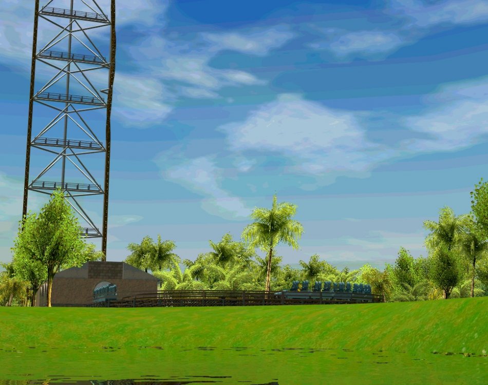
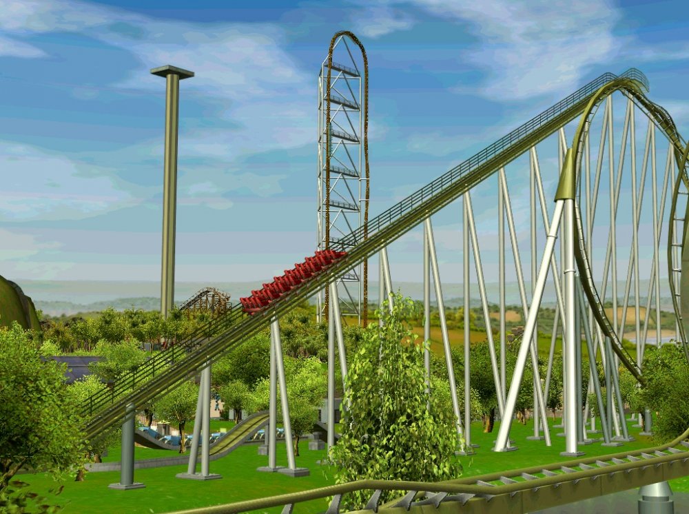
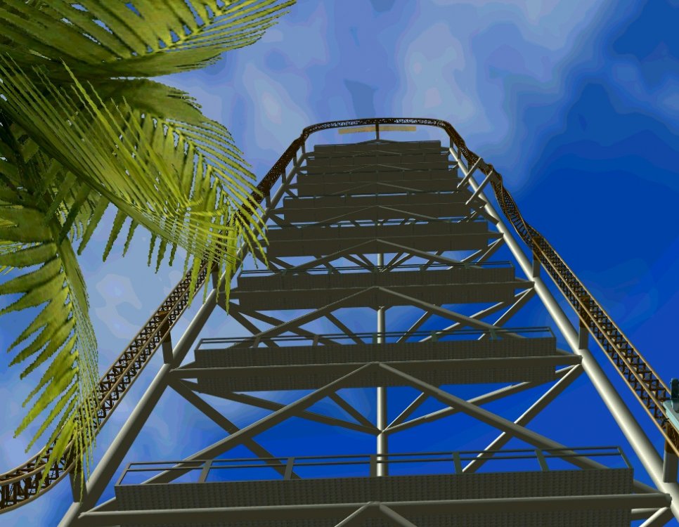
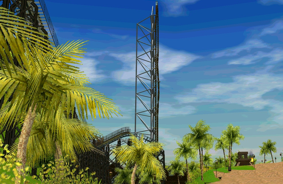
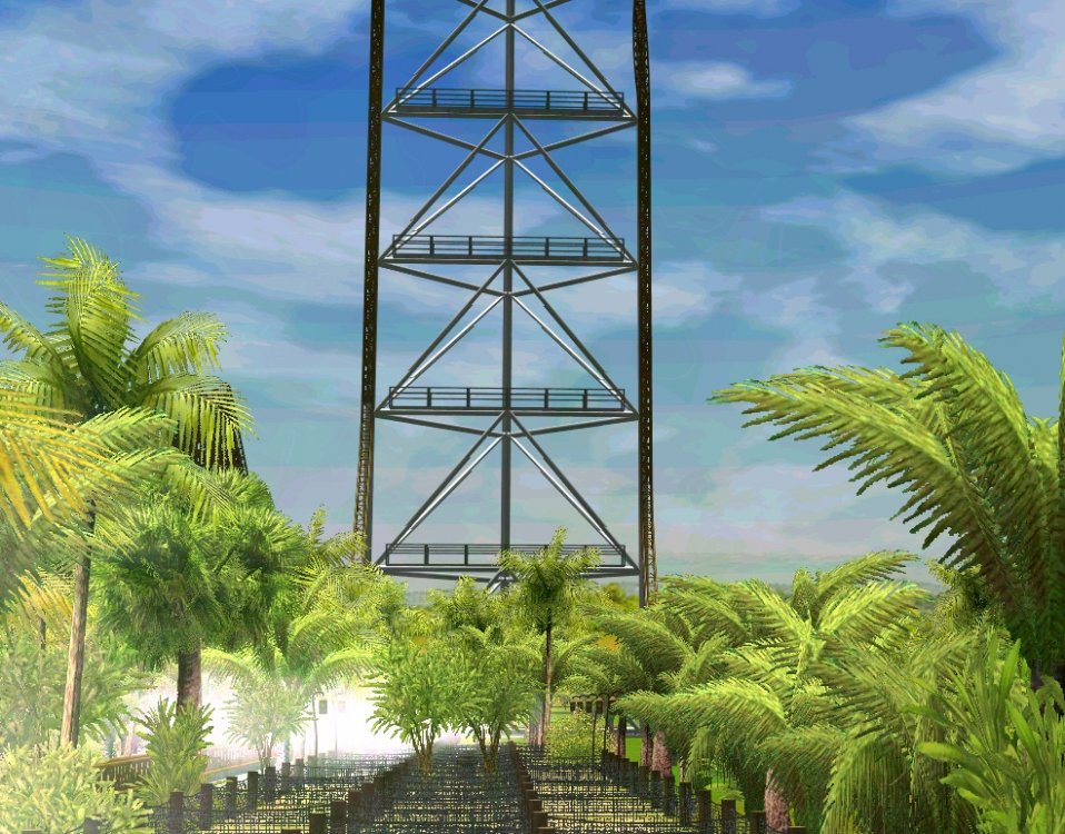
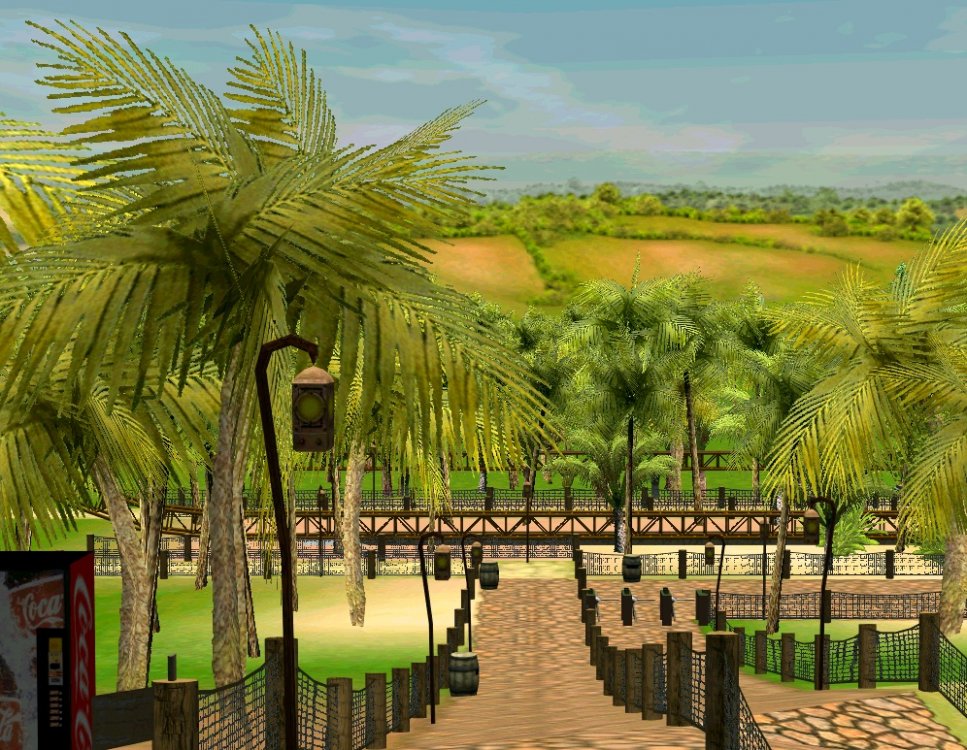
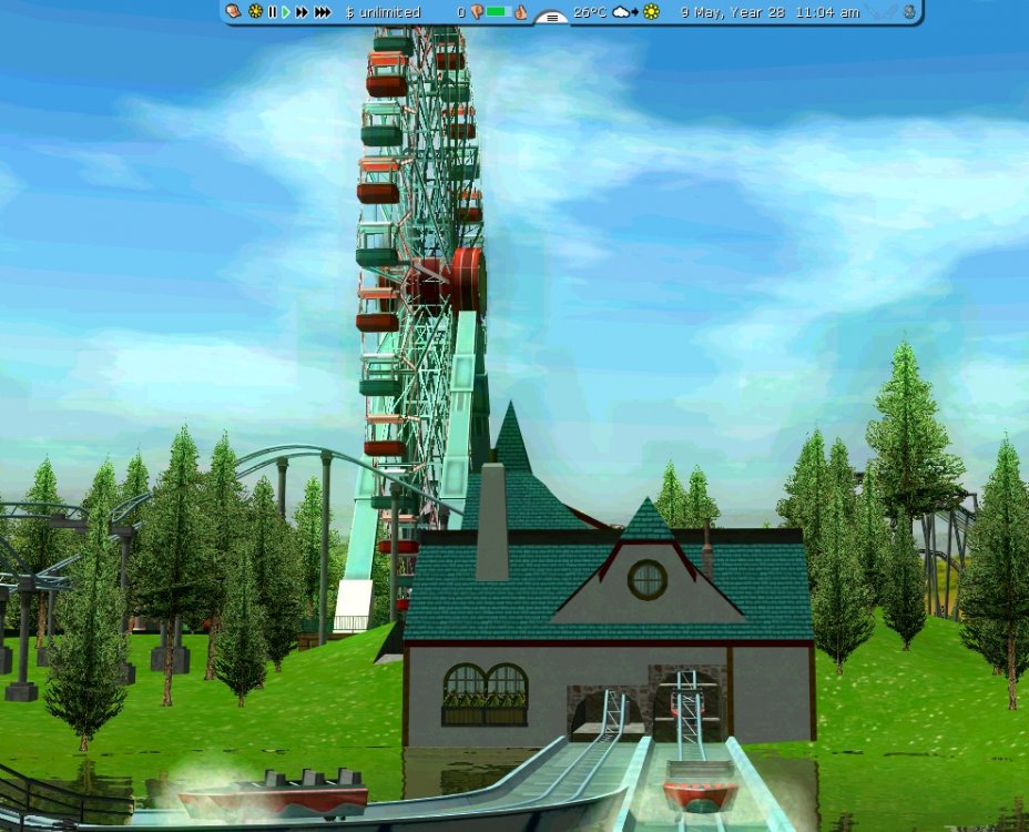
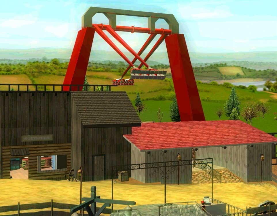
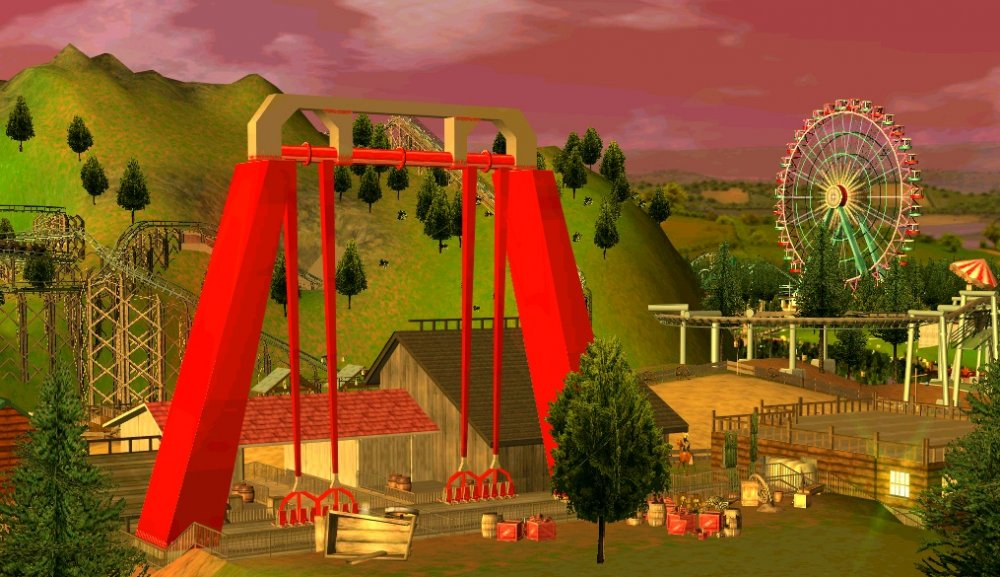
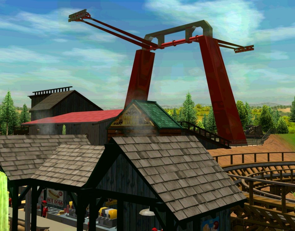
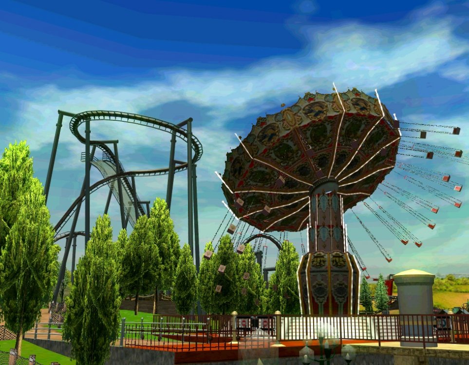
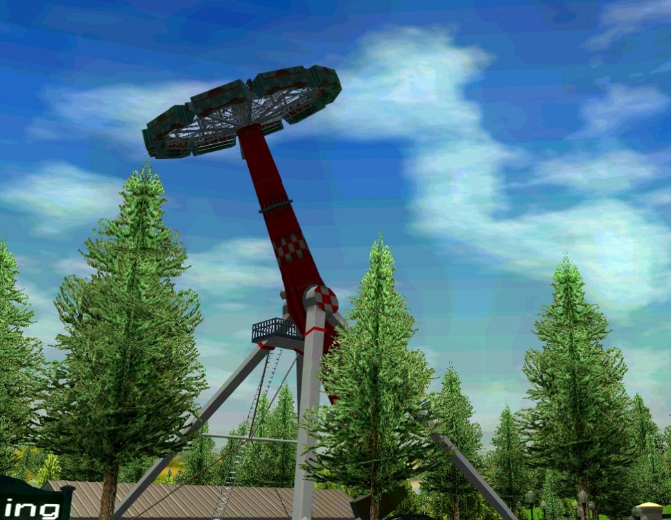
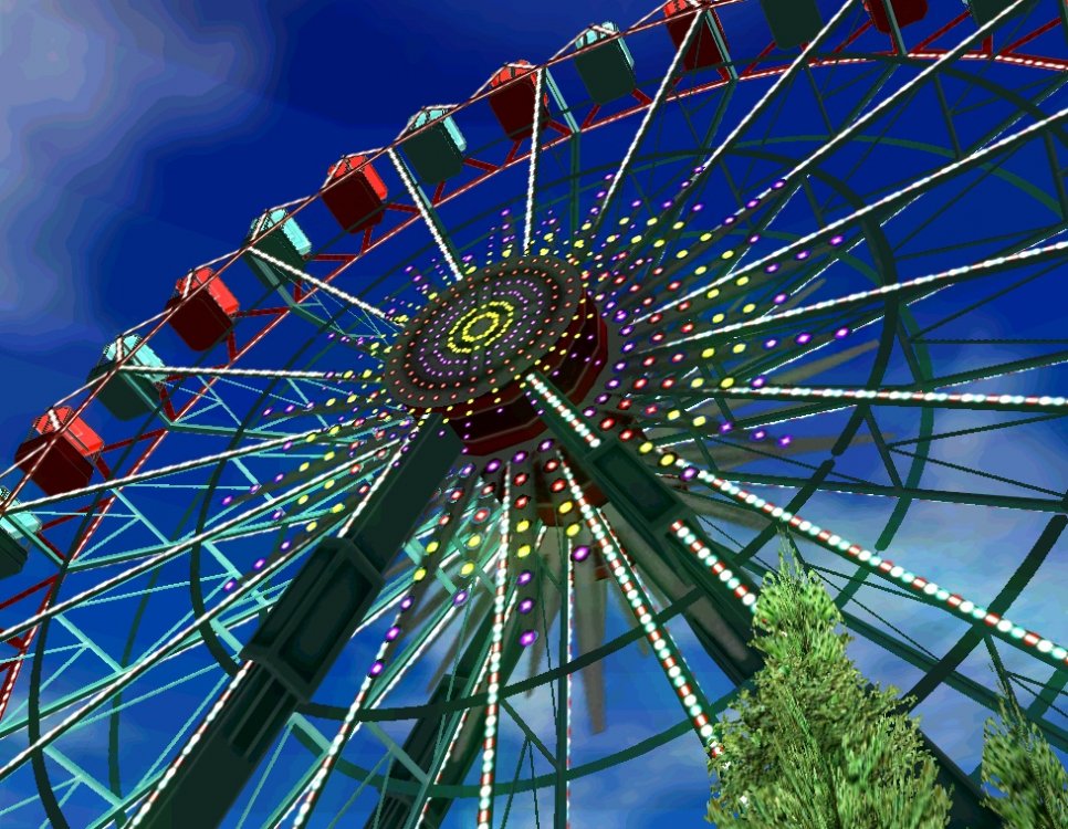
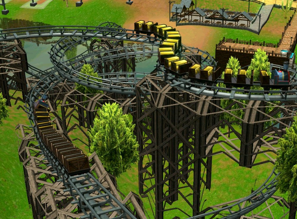
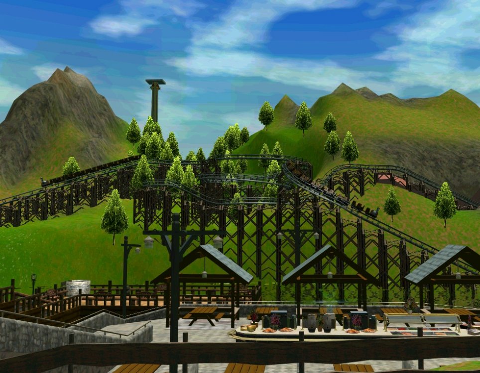
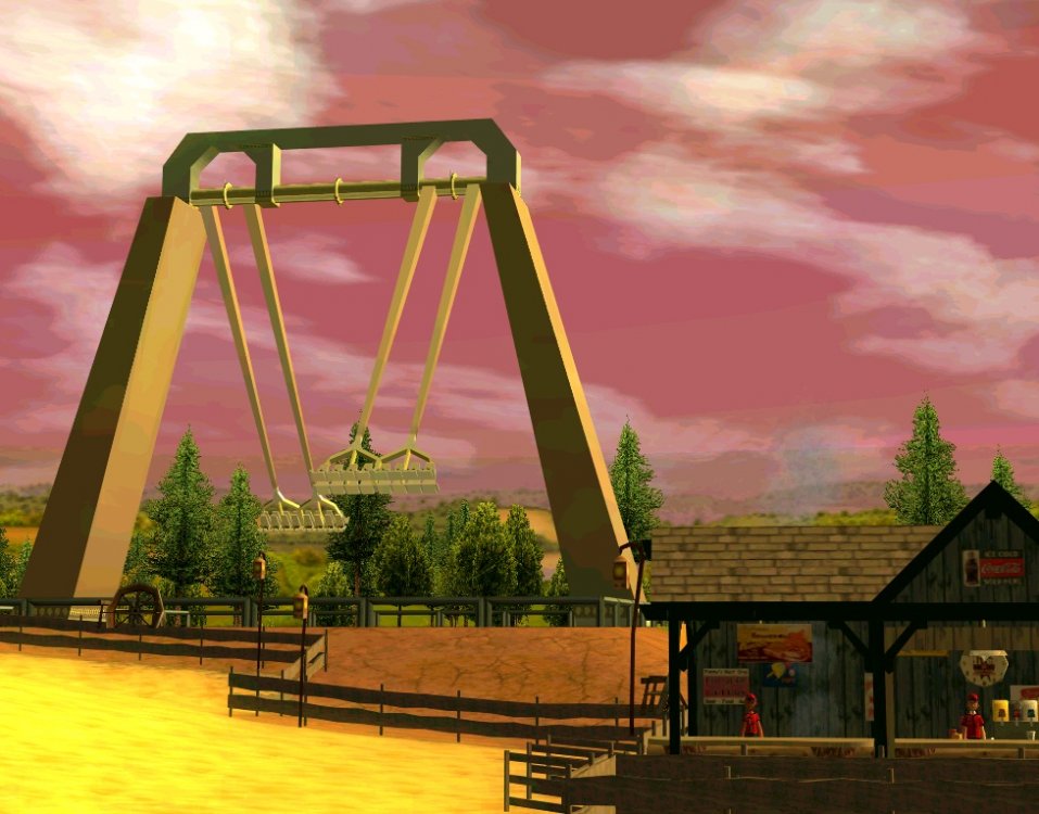
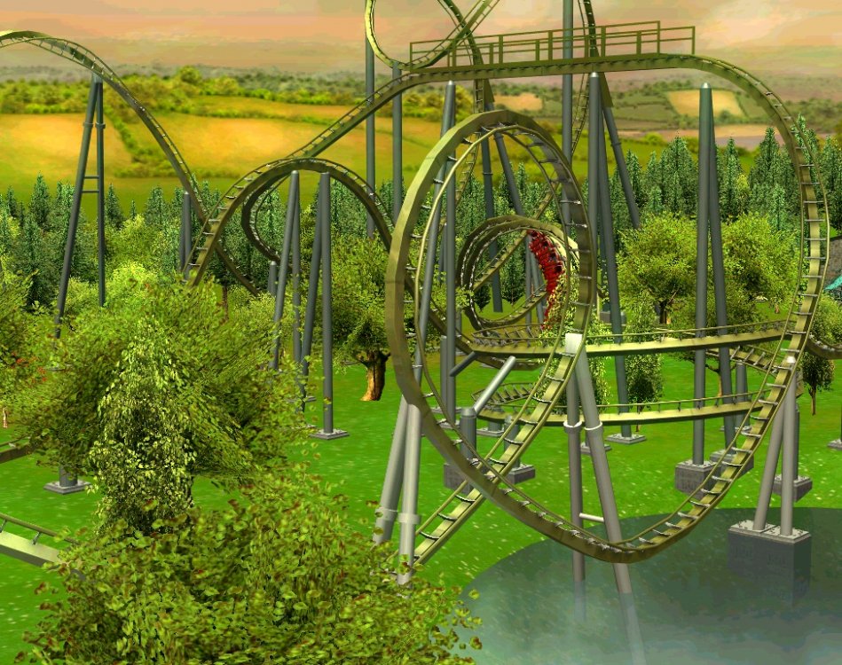
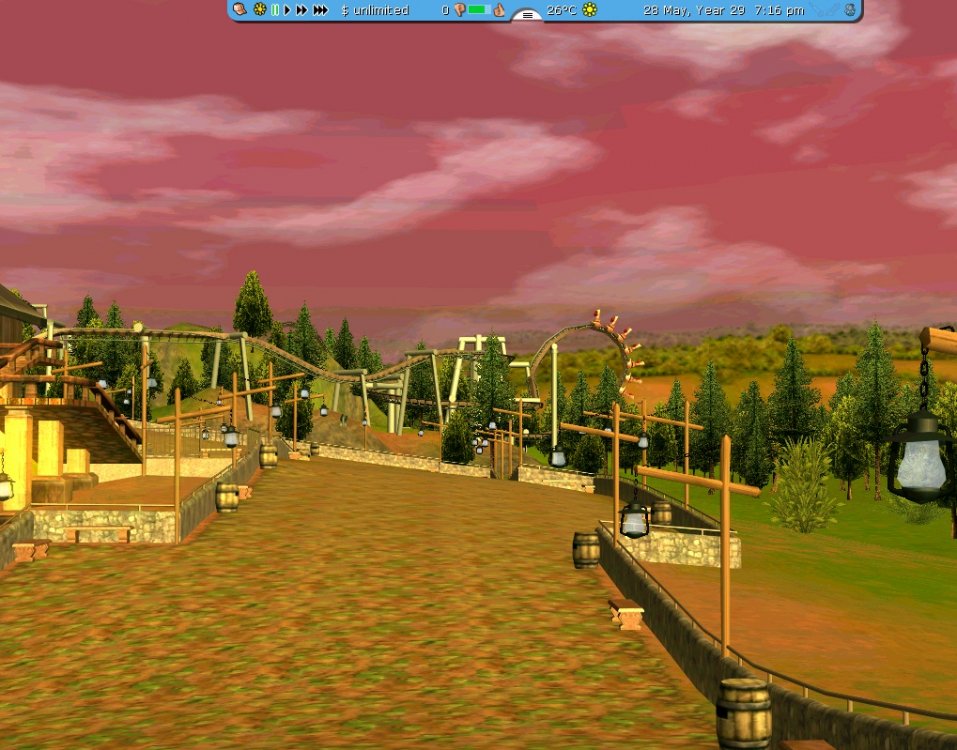
6th update! Hi all! Today is going to be a huge update including: Dynamite, S&S screamin' swing. Mack Water Coaster preview. The Eagle POV!!! [coastertube]http://www.themeparkreview.com/coastertube/play.php?vid=The_Eagle_6fq4[/coastertube] ...and much more. That's all, folks! Be sure to comment and reply! Mackness. Just threw a random Sky Stallion pic in, I haven't shown you much of this ride. It's as red as my captions suck. It's a nice Screamin' Swing... Or what those things are called. And the newest one is this, called Dynamite. It has! To all that said the park hasn't flats. Awesome. It even got itself a 2 minute, crappy logo! Mountain Monster is still there... Speaking of Maniac Mine train. This ride has some pretty awesome twisty bits high up in the air! Maniac Mine train in the background... This outdoor buffet just opened in cowboy town.
-

[NL] Project Dragster!
coaster1000 replied to thrillrideseeker's topic in Roller Coaster Games, Models, and Other Randomness
Looking at this, it's just like the real life pictures of CP! It looks very, very accurate, even though I'm not into NL at all. -
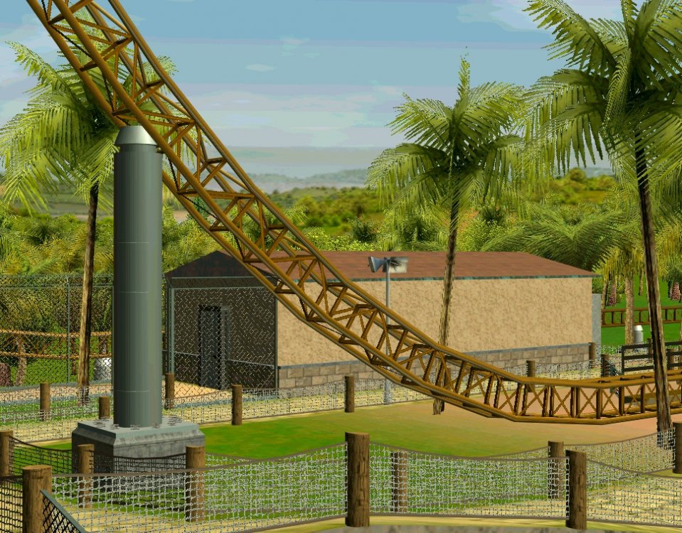
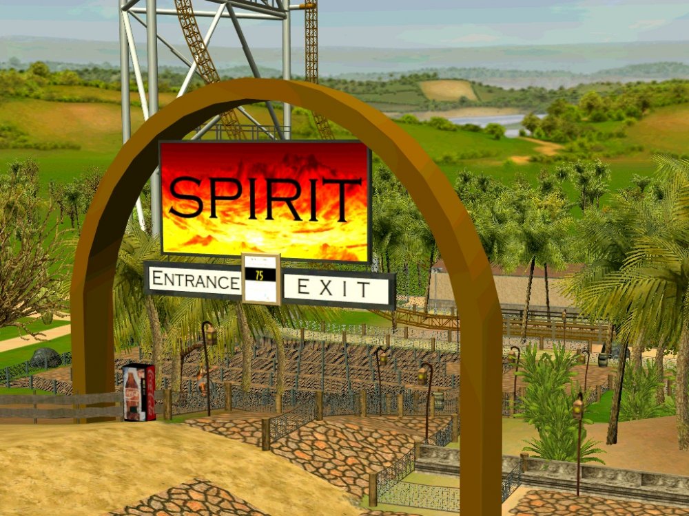
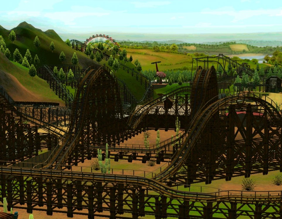
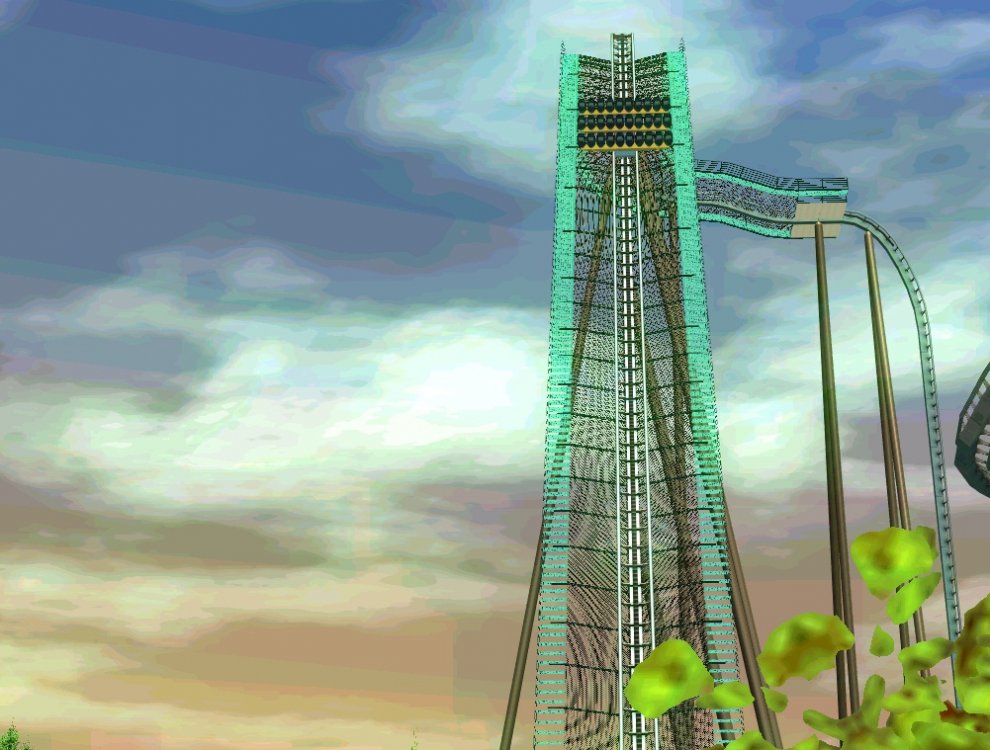
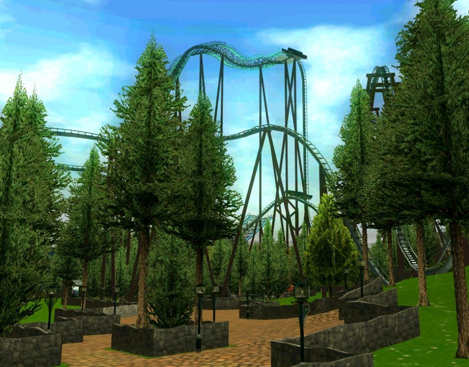
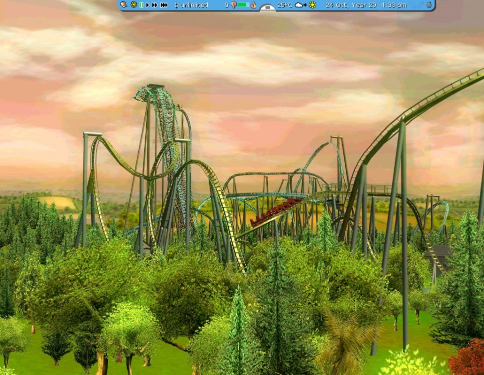
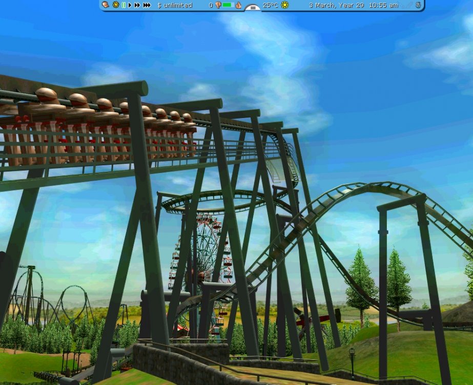
^ Thanks! 83 mph., 2 (3) inversions, roughly 230 foot - and... an excitement rating of 6.7 Don't ask me why, maybe it's just the CTR. And a huge thanks to Mastersax for sending me a PM with a link to some footers. I downloaded them (dasMatze Utilities) and they're so good that I've got no excuse for using them. I hate you Mastersax. I spend 3 hours today putting them beneath the supports of the 3 largest coasters. It isn't always a perfect fit (I use SteelWorx) but at least it's better than no footers. coaster "I hope you got the friendly tone" 1000 "Footing" this ride was a pain in the *** See you! It took so long I'm dull enough to show you pics.
-
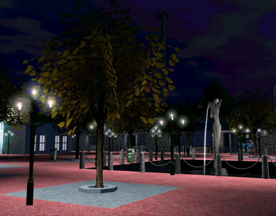
This could really turn into something interesting! I like the overall idea of this park. There's not much to comment about yet, but I suggest you removing the hedge fence, and replace it with something a bit more realistic. Also, if your plans are to make a very large park, I'd suggest you redoing some of the entrance plaza. This is a lot of work to do, but it's better to do now, instead of being unhappy with such a small entrance when you have no space for expanding. Looks like it is going to be a beautiful park, though.
-
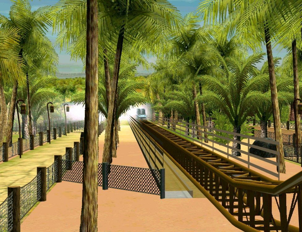
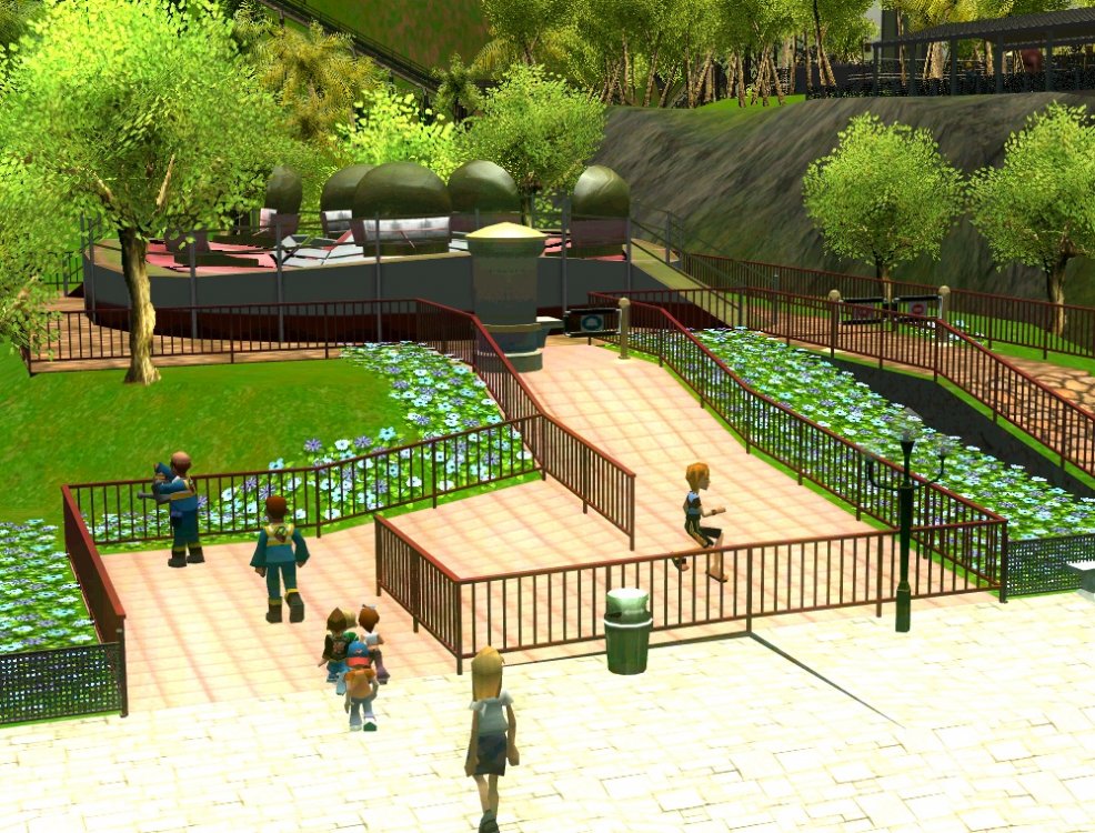
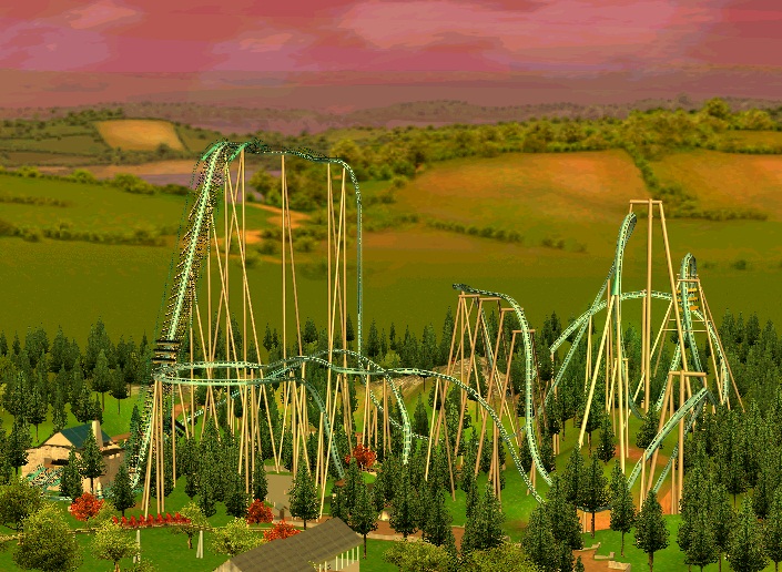
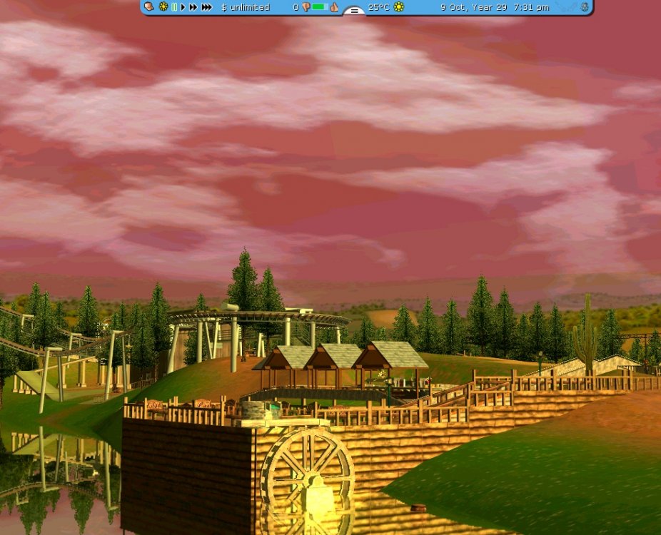
Update! Mountain Monster is FINISHED! And The Eagle is close to completion, too. Postcard. Be sure to reply and comment! See you! I'll finish the update with a couple of Mountain Monster pictures. The little pavillion offers a scenic view of the lake. From a distance. This area is going to have a lot of restaurants, etc. For some reason the game doesn't allow me to place rides entrance/exits there. Weird. The Eagle. This ride is awesome.


