AlmereStars
-
Posts
1,018 -
Joined
-
Last visited
Everything posted by AlmereStars
-

Photo TR: Hanno at TPR's Scandi Trip 09
AlmereStars replied to Hhappy's topic in Photo Trip Report Archive
Hanno, your picture amaze me everytime!!! A lot of picture of what looks like a great day. Hopefully I will visit this park, cause Balder just looks like pure fun. -
RCT3 | Het Groene Woud
AlmereStars replied to AlmereStars's topic in Roller Coaster Games, Models, and Other Randomness
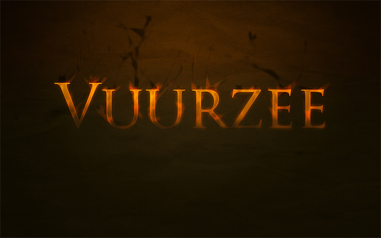
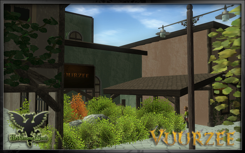
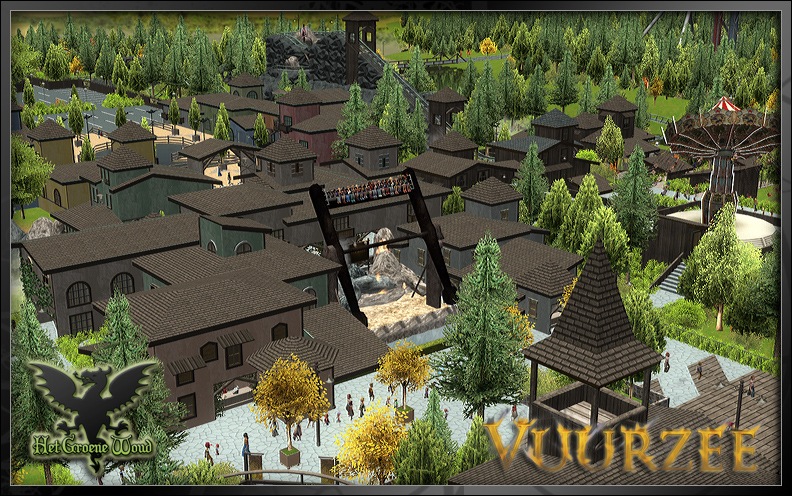
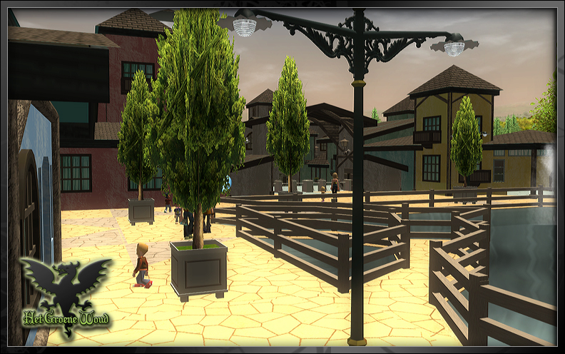
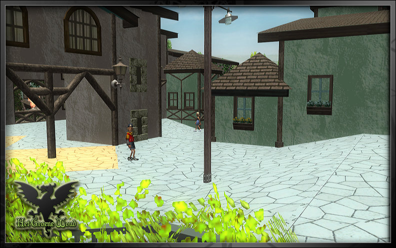
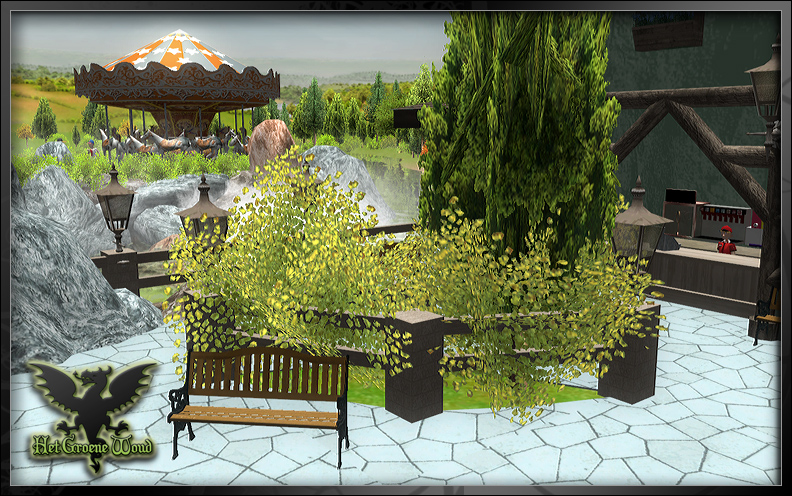
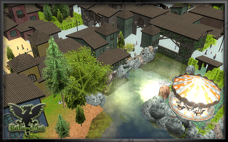
^Thank you! Update #3 | Don't get burned yeah I update fast with this park, I know Today we get to a new attraction. Its called Vuurzee, which is dutch for Inferno. this is its logo Its a top spin (thank you mennoo for your great CFR!!!) First yet another picture of the Merry-go-round Getting excited?? this is the entrance Its caved between the buildings. Watch out that you don't get burned! You can view Vuurzee from behind (no not take it from behind, view it!) Lots of buildings There are some people who will puke in a view seconds Watch out for more updates soon!
-
Knowing you, the theming will be great! I'm happy with the lay-out.. I'll be waiting for more
-
For all the sportsevents that are being held during the Olympics, Speed Skating is by far the most populair sport here in Holland. We always expect to get our gold medals at those events. And yeah, everyone expected gold from Sven Kramer. The pressure on him was huge! He was the only one to be able to lose, everyone else could only win. And hes only 23 years old. According to the first statistics 4.7 million people watched the event live. Considering Holland only has a population of 16.5 million, its a pretty big number. And off course the skatingarena held a lot of dutch supporters (including an orchestra). We also have a "Holland House" somewhere in Vancouver, were all the sporters are being honoured by the dutch. Thats always a really big party, with our next King and Qeeun just partying along with all the others
-
The openingceremonie was okay. I always find those things a bit boring, with some highlights that are cool (the wales looked awesome!). They did use a lot of "old" music though.. I mean, Hallelujah? Although a beautifull song, it is old and done alot. We just got our first gold medal!!!!! Off course with Speed Skating
-
RCT3 | Het Groene Woud
AlmereStars replied to AlmereStars's topic in Roller Coaster Games, Models, and Other Randomness
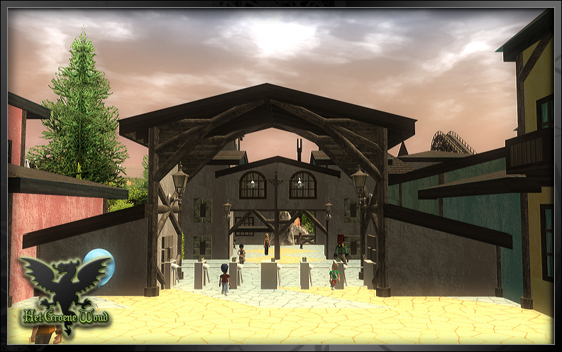
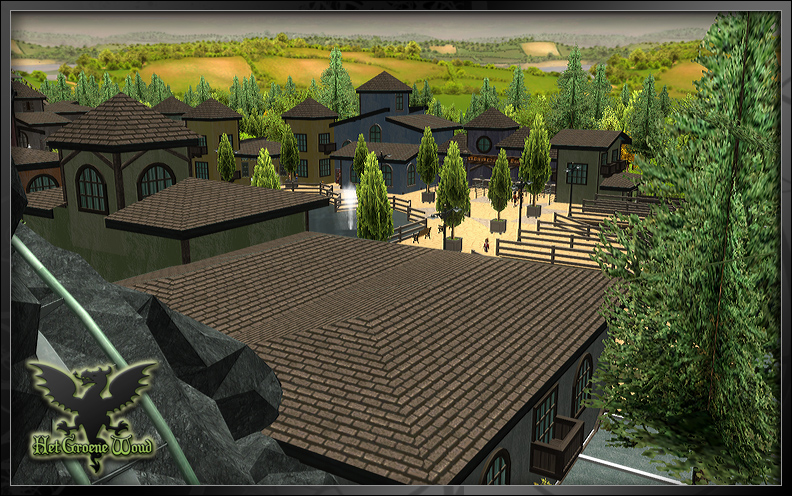
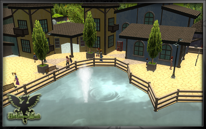
I agree steffen Update #2 | Taking Over The drive down to the park is over.. the car is parked and locked safely. Time to take over the park!!! Going up a bit to enter the plaza Lots of shops up here, but we want to go to that thing right there! The entrance gate! First we got to buy us some tickets though Or you don't buy them and just jump over the turnstyles BREAKING NEWS : We are in the park! First attraction named Draaimolen, dutch for Merry-go-Round lets play a new game.. called insert-your-own-caption-here Random shot A overview shot of the entrance plaza Thats it for this update! hope you like it
-
RCT3 | Het Groene Woud
AlmereStars replied to AlmereStars's topic in Roller Coaster Games, Models, and Other Randomness
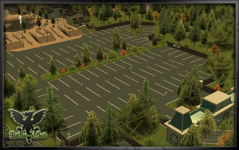
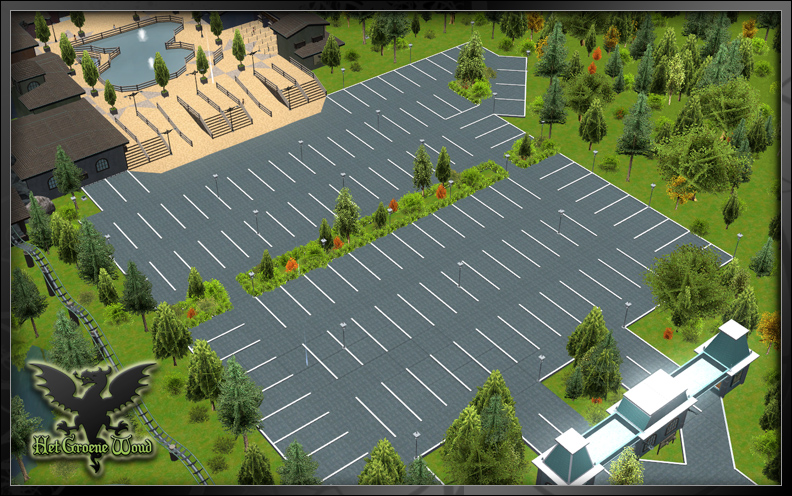
Mini update 1.1 Okay i've improved the parking lot and added some fences along the road as well as some welcoming signs (in dutch and english). Improved road parking lot.. Dark picture, don't know why actually?
-
Looks great, the log flume is nice addition. May I suggest covering it up with Imagitions Flume Covers
-
aaahw some people wont pound it! The park looks realy futuristic and awesome! Koreans (most asians for that matter) are crazy when it comes to stuff like this. The rollercoaster will take you down into the sea.. uhm I can't wait to see the theming for that.
-
RCT3 | Het Groene Woud
AlmereStars replied to AlmereStars's topic in Roller Coaster Games, Models, and Other Randomness
^Your absolutly right! I haven't thought about fences/railings around the road and parking lot. will do that soon, thank you -
RCT3 | Het Groene Woud
AlmereStars replied to AlmereStars's topic in Roller Coaster Games, Models, and Other Randomness
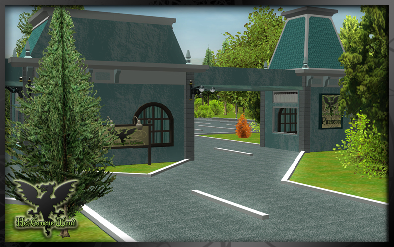
KPWoCkAxX: Your in luck! today is the first official update Steffen_Dk: no not full of critism, full of constructive critism and thats a really good thing! You always point out what can be improved and how you can achieve that. Someone like you makes other build better mcjaco pfiew, escaped the bullet there Update #1 Going to the Park So today were making a trip to the park... Our first one!!! Woooeee!! Advertisment... getting closer... Is that the mine ride?? We made it!! at least we made it to the parking lot entrance Not that big, but a few cars can rest here The view from the parking lot
-
RCT3 | Het Groene Woud
AlmereStars replied to AlmereStars's topic in Roller Coaster Games, Models, and Other Randomness
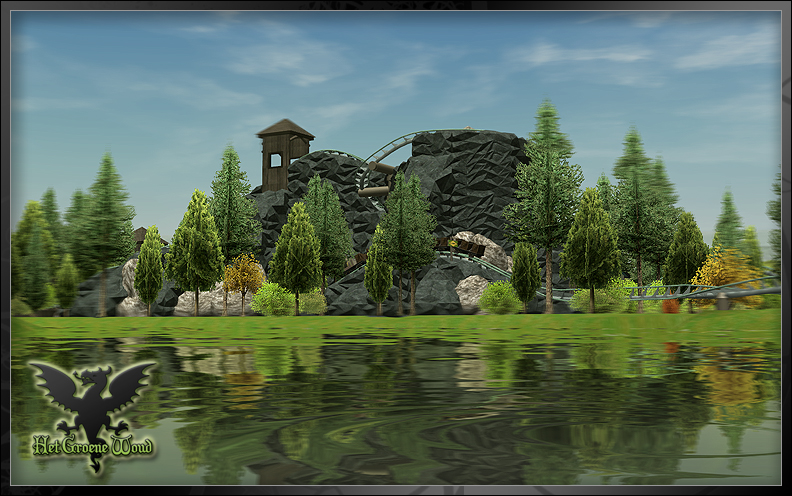
@KPWoCkAxX: Thanks! You will have to wait a while, since I'm not starting my updates with the mine ride I do end this post with a nice pic of it though @Coaster Cow: Thank you @dmaxsba2408: I got bored and wanted to use the videocapturing options the game gives you.. I geuss it is something else @KDcoasterMAN: Thanks! @ Steffen_Dk: aaah there you are, You wouldn't be Steffen if you hadn't some constructive critism I hope you go back to making parks again since I always loved it About your points: 1. It is repetitive, but thats more because it is the main theme troughout the entire park. Actually it is the only theme, with the water ride and the mine ride being somewhat different. I stuck with 1 theme because the park is rather small. 2. As it looks now on the video it does seems a bit boring. But I won't change the buildings, I did put in some details. So I hope I can prove you wrong on the ride being boring Heres a shot of the Mine Ride The Mine Ride preview
-
I would try to make your picture less blurry, it gives a nice effect but your overdoing it. The parks looks good. Got a nice "old" feeling
-
[RCT3] Emporium Studios
AlmereStars replied to FLIPDUDE's topic in Roller Coaster Games, Models, and Other Randomness
Im geussing the theme is a flooded city?? Anyways the feeling of the park is great. You put a lot of thought in the rides themeself. Great use of CTRs and CFRs. The thing I have a problem with is that almost every rooftop is flat. You do use some CS.. why not try to make some better roofs? -
You don't have to update every week The river looks fine to me .. Expect some difficulties when you build stuff around the river. I had to do a lot of relandscaping when I made River Forrest
-
So guys, I've been away for a while now (almost a year that I haven't touched RCT3). Meanwhile some things changed, I moved to a new home.. got a new job and well I got a new computer! (kicks the ass out of lagging). only sad part is, I wasn't doing anything with RCT3 during that time and I forgot to copy my previous park I was doing (Aquatastic).... But I made a new park, I won't post any screens just yet. But off course mcjaco is watching so I have something better... A promo video!! I hope you approve this mcjaco, if not then just say so and I will post a few pics along with the video http://www.youtube.com/watch?v=9-7jPdiYCrg see you soon! Park Logo
-
Wooow dude youre still doing this park!!! Thats good news actually still looking good! I like Millipede's Station
-
Wooow nice park!!! looks really good keep up the good work. So I know this is old england.. like old old.. but why are those roman/greek collumns there? The only thing I can suggest is use pathcovers. Right now you use the generic asphaltpath but if you use pathcovers (accenea's or someone elses) you can create better squares and stuff
-
TPR's New Forum UPGRADE!
AlmereStars replied to Hhappy's topic in Theme Parks, Roller Coasters, & Donkeys!
I'm sure it will have some issues in the beginning, but looks great Hhappy! Wat wij nederlanders allemaal wel niet kunnen -
An Upgraded TPR Forum Coming Soon!
AlmereStars replied to robbalvey's topic in Theme Parks, Roller Coasters, & Donkeys!
Uhm that didn't come out as I expected. This looks a little bit boring. But when its filled with text it will look better I think -
An Upgraded TPR Forum Coming Soon!
AlmereStars replied to robbalvey's topic in Theme Parks, Roller Coasters, & Donkeys!
Well it works pretty good over here. I'm gladd the yellow border is removed when attaching a picture! I always thought that was ugly I got a few really small things though The line in the green box isn't centered. But it isn't alligned to the right either. I don't if this is supposed to be like this, or if its just a browser error. Browsing with FireFox 3.5.7 btw. I also don't like the black boxes in the calender. I would make them the same grey colour as the background, so you can see the date/clock and calender logo but not the whole box and in the second picture you can see that the whiteline seperating the user info with the post itself doesn't make it all the way to the bottom when the post is smaller then the user info. I'm also missing a dropdown menu where you can choose the page where you want to go. Edit: never mind about this one, if you click the white link saying "page 1 of .." you can fill in the page number you want user info green box
-
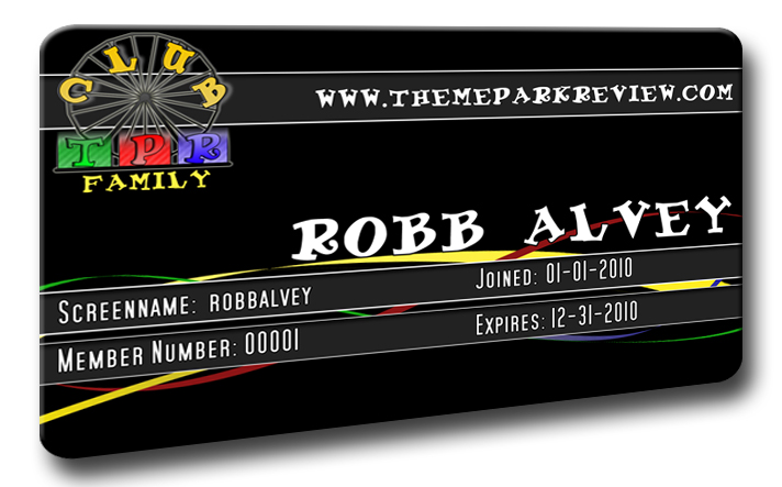
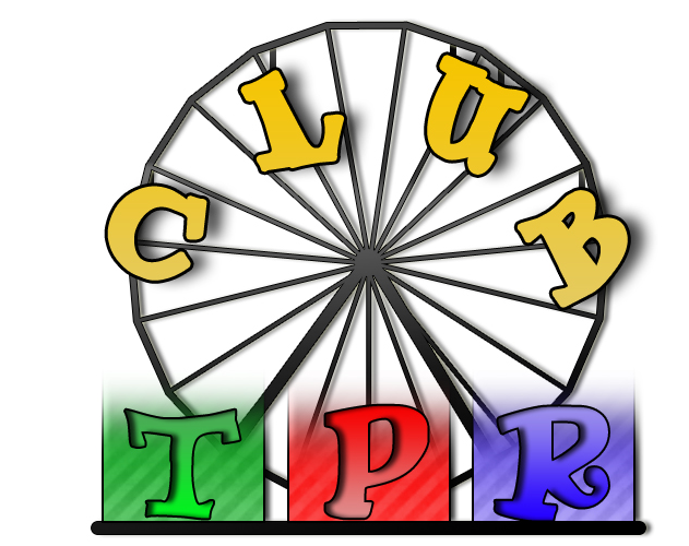
Club TPR's Final Membership Card Design
AlmereStars replied to robbalvey's topic in Theme Parks, Roller Coasters, & Donkeys!
That looks great!! its always lots of fun to participate in these kind of things. lots and lots of different ideas blend into 1 card and you get this Thanks all who voted for me, got more votes then I expected.. the best cards obviously "won" the poll. -
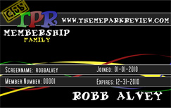
OFFICIAL ENTRY Okay, I didnt have a lot of time to work on a logo and a card so this will be my official entry. I made an entirly different logo, but the card is still the same.. Its not that proffesional as some of the other logos and cards that have been post here so I probably wont win the poll, but thats okay. I do it for the fun and learn some new stuff with PS card Logo
-
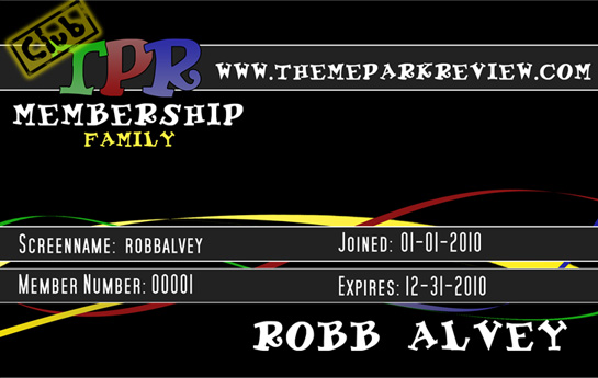
Woow this thread exploded when I was asleep!!! some really nice logo's/ cards here! Ive done some retouching, so here it goes and the actual size, al a bit blurry.. gotta work on that big version of the new card, I removed the vertical bar and replaced some stuff. I think I will change the "club" on the logo, since it isn't standing out as much as I liked new logo, not happy with the "stamp" so it probably will change
-
Thanks for the suggestions everyone, I'll try to make the design better I gotta say that I really like the designs of n7!