DougMJr
-
Posts
1,741 -
Joined
-
Last visited
Everything posted by DougMJr
-
^I totally forgot about that... wow now I feel kinda horrible.
-
The End of the Internet.
DougMJr replied to Chroniq's topic in Theme Parks, Roller Coasters, & Donkeys!
^Here ya go. A map pin pointing all supporters and opponents. http://www.spatialsituation.com/sopa-map/ -
I feel like RoS could be retheamed as something patriotic. Perhaps add a tunnel or something. Also I'd think it would be cool if they added water cannons similar to maverick's on the straight away over the water. Also, I want them to sell moto-coaster and put a themed El loco in its place... but that is just me.
-
The Santa CLAW! Live Claw Machine - Crane Game!
DougMJr replied to Skramp's topic in Theme Parks, Roller Coasters, & Donkeys!
Look what popped up in a certain cafés window in Dayton Ohio. Photo credit circa71 on instagram Cannot Wait!
-
The End of the Internet.
DougMJr replied to Chroniq's topic in Theme Parks, Roller Coasters, & Donkeys!
I think the blackouts are a great idea, but I totally disagree with the twitter CEO. To me it came off as criticizing companies who decided to black out. I know some people really rely on twitter, but imagine if it was blacked out forever? One thing that would have been cool is if Google blacked out all the search results leading to "blacked out" sites. Just have the web spiders look for the JavaScript code. -
Thorpe Park Discussion Thread
DougMJr replied to Rooey's topic in Theme Parks, Roller Coasters, & Donkeys!
Can't wait to see a POV. Man, it sure seems like all of 2012's coasters are going up really fast. -
Six Flags St. Louis (SFStL) Discussion Thread
DougMJr replied to Homer's topic in Theme Parks, Roller Coasters, & Donkeys!
^But on the other foot, not everyone is into thrill rides. Like Godwyn said, some people go there just for the water park and do not even use the theme park. You cannot please everyone every year. I'm sorry to say this year isn't your year. -
So sad to see loss of life. You would think that there would be multiple safeguards to keep this from happening. Props the the crew and rescue team for getting the survivors off safely.
-
TPR Front Page RE-Design Contest!
DougMJr replied to robbalvey's topic in Theme Parks, Roller Coasters, & Donkeys!
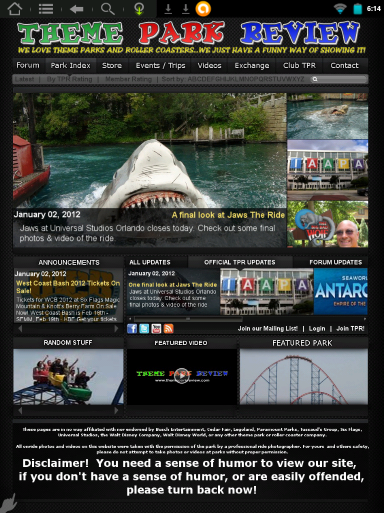
That being said, this will be my final submission. I just didn't want to abandon this draft midway through. Click to Enlarge Tablet Friendly IPhone friendly Features: -Feature story carousel. -Scrollable "Timeline" updates, with three options. Offical, Forum, or combined. -Hover over image for description, very minimal text. -Drop down menu, changes whenever you hover over a different "tab." -"Featured Park" section will draw traffic to the park index. -Tablet friendly, and usable on mobile devices. -Contains pretty much all of the functionality of the current Front page and then some. -Modern "2010" design, inspired by Apple. Whatever design is picked, I'm sure it will be great. Even though mine may not stack up against David's or Jack's designs I am very proud of it. This was a lot of fun.
-
TPR Front Page RE-Design Contest!
DougMJr replied to robbalvey's topic in Theme Parks, Roller Coasters, & Donkeys!
^So are you not accepting any more submissions? Just curious. -
TPR Front Page RE-Design Contest!
DougMJr replied to robbalvey's topic in Theme Parks, Roller Coasters, & Donkeys!
So I've been following the tread the past couple of days and I've decided to get back in the game as today I do not have to work. I've started (almost) from scratch and I've taken concepts from other designs I liked and started putting them together. This is what I have so far. Click to Enlarge I feel like this is at least better than what I had before. Some things to note: -The images on the right of the large feature is a "caurosel." You can click on them to jump to a featured story or simply wait for it to change by itself - An image's description will appear when you hover over it. - The updates section has 3 "timelines." An "all updates" timeline, an "TPR Official" time line, and a "forum only" timeline. - The Announcements section will change between each announcement every 10 seconds or so. - The drop down menu will feature the horizontal layout as featured in a design earlier in this thread. I still have to add some things, I just want some feedback while I take a break to eat.
-
Hmmm... Not sure how I feel about this new logo. Sure it fits the park better than the old logo, but it's ugly in my opinion.
-
TPR Front Page RE-Design Contest!
DougMJr replied to robbalvey's topic in Theme Parks, Roller Coasters, & Donkeys!
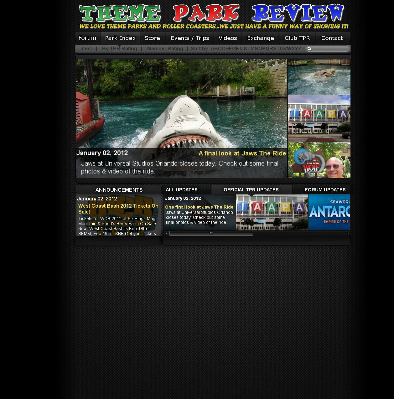
So I just woke up and got back to working on my design. I eliminated most of the text and used pictures with captions instead. There is some functionality I should explain however. -I was thinking the "More Theme Park Review Updates" section could work almost like a queue. As in it will also swipe, and whatever story goes away will then appear in the "main update" section. A great example of this is within the iTunes store on your Mac or PC. Go there to see exactly what I'm talking about. -The "Parks News..." section would also rotate or scroll. Preferably scroll. -The "random" section would change every minute. Click to Enlarge I also decided to nix harsh borders in favor of a solid black to transparent gradient. This prevents images from bleeding into each other while avoiding harsh lines. Still to be added is the footer and disclamer. What do you think?
-
TPR Front Page RE-Design Contest!
DougMJr replied to robbalvey's topic in Theme Parks, Roller Coasters, & Donkeys!
Just thought I'd check the thread one more time before I went to bed. Robb I understand your points. I think I may have a solution. I'll see how well it looks tomorrow. Hopefully by replacing text with images my layout will be less cramped. Also, if you happen to have any suggestions on how the navi bar can improve let me know. So note to self, tomorrow: -Axe the text. -A picture is worth 1000 words. -Unite, don't divide. Remove borders -Keep the nav bar in mind. -A little space will do some good. -
The Santa CLAW! Live Claw Machine - Crane Game!
DougMJr replied to Skramp's topic in Theme Parks, Roller Coasters, & Donkeys!
^That seems logical to me. And that picture posted earlier could be a giant bowling ball! -
Hersheypark (HP) Discussion Thread
DougMJr replied to robbalvey's topic in Theme Parks, Roller Coasters, & Donkeys!
I think i305's box-lattice is more astetically pleasing, but then again i305 doesn't have wing rider trains. I still cannot get over how few supports will be holding this thing up. Modern engineering at its best! Edit: v Hardy Harr Harr. -
Thorpe Park Discussion Thread
DougMJr replied to Rooey's topic in Theme Parks, Roller Coasters, & Donkeys!
^Yeah, I don't think there is anything on the trains, or on the track, that suggests that the seats will rotate at all. sorry. -
TPR Front Page RE-Design Contest!
DougMJr replied to robbalvey's topic in Theme Parks, Roller Coasters, & Donkeys!
^^^I will definitly consider that. Perhaps that third collumn could be the "random" section I still have to add. I was thinking about the scrollbars earlier, a good idea. Not sure why I didn't implement it earlier, probably just had other stuff on my mind. ^I understand the desire to have a ultra-modern apple-esque website, but I'm not sure if that is really TPR's style. This site to me has never seemed like a minimalist san-serif type of community. I currently like my navi bar because it's kinda a mix between new and old, familiar yet more modern. I hope you enjoyed your photoshop class and I would definatly encourage you to submit a design of your own! Even if it isn't chosen keep the files because you could always use it in a portfolio or recycle some of the icons you create for another project. On a side note, I'm really impressed with how many great ideas and designs everyone has created in less than 24hrs. I'm partial to DKR's, AidanCKY's, & Angry_Gumball's designs. Anyway I really should call it a night. I've been sitting at my computer for far too long! -
Thorpe Park Discussion Thread
DougMJr replied to Rooey's topic in Theme Parks, Roller Coasters, & Donkeys!
That train is wicked! It looks like the LEDs in the eyes will move in sequence so that will add a cool effect! How do you think they are powered... LEDs don't take much power, and it's impractacle to have a huge battery on board. Do they just use a capasitor like GL at movie world? -
Coolest Ride Vehicles
DougMJr replied to Cerberus's topic in Theme Parks, Roller Coasters, & Donkeys!
^ While those trains are great, and NTAG in general is awesome, it is not a woodie. -
TPR Front Page RE-Design Contest!
DougMJr replied to robbalvey's topic in Theme Parks, Roller Coasters, & Donkeys!
^Thanks for the suggestion. Do you think it would help if I simply switched the "Announcements" Section with "Parks, News, Trip Reports, Ect." Section? The only issues I see with doing this is it will not be a clean collumn down the right side. I'll see if I can come up with a better solution. My most important concern is if anything seems confusing to anybody? Does anything seem counterintuitive? Do you feel somewhat familiar with it or does it alienate you? -Doug "I reject your reality and photoshop my own" Mandell Jr. -
TPR Front Page RE-Design Contest!
DougMJr replied to robbalvey's topic in Theme Parks, Roller Coasters, & Donkeys!
^You know what, now that you point it out... I completely agree. I don't want to add alot of space, but enough to make it look like they are not on top of each other. That is something I'll tackle tomorrow. Thanks for the feedback! -
TPR Front Page RE-Design Contest!
DougMJr replied to robbalvey's topic in Theme Parks, Roller Coasters, & Donkeys!
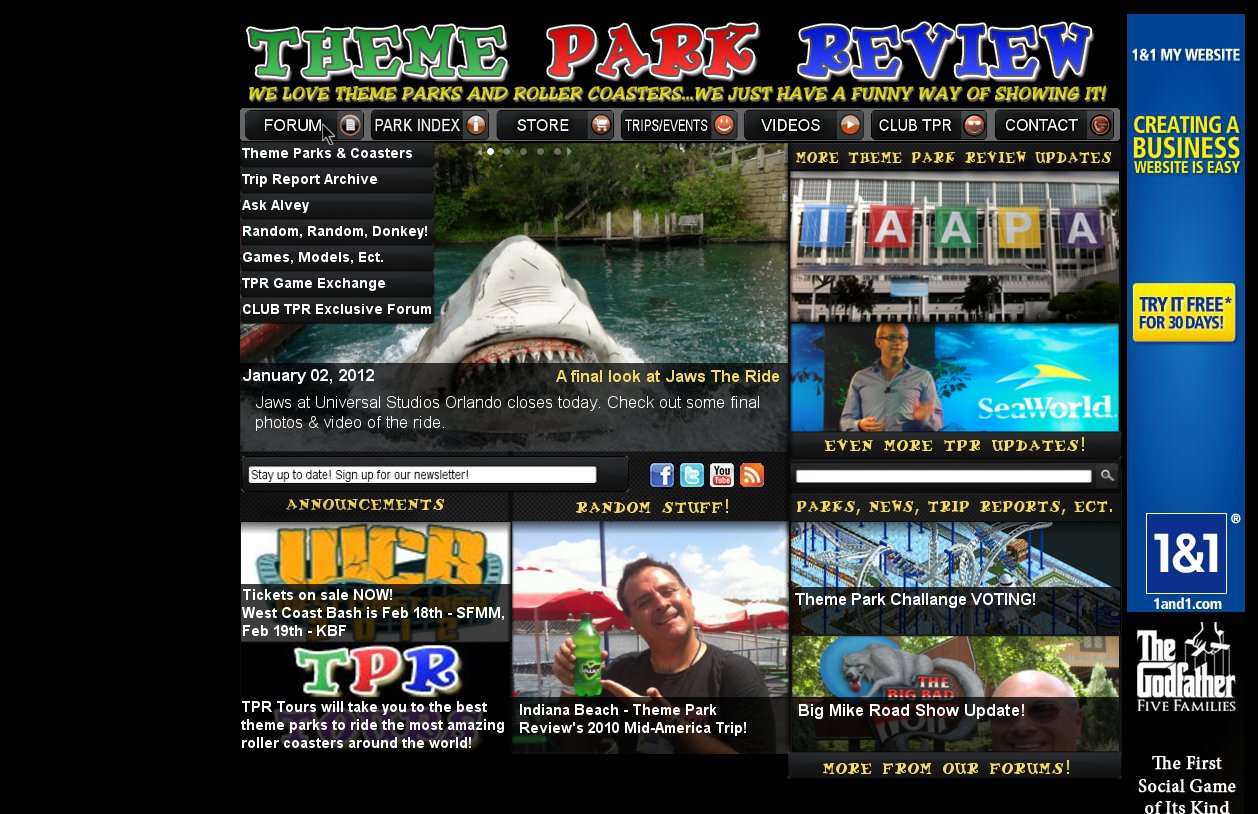
Just read robbs point about the less words thing... I guess I'll have to radically change my design to achieve that goal. I'm ok with short descriptions next to photos but I'll see what I can do. Anyway, as far as my current design goes I've added a drop down menu, the newsletter and social links, as well as a little cleaning up here and there. I think I'm done for tonight. I'll see what ideas I can come up with tomorrow. Click to enlarge. Once again any suggestions will be appreciated. I feel like this design may also work ok with tablets and mobile devices as you do not have to scroll, and you can click on the images to navigate to each post.
-
TPR Front Page RE-Design Contest!
DougMJr replied to robbalvey's topic in Theme Parks, Roller Coasters, & Donkeys!
^There will be a little scrolling probably, I'm not finished yet. But I'm glad you like it. -
TPR Front Page RE-Design Contest!
DougMJr replied to robbalvey's topic in Theme Parks, Roller Coasters, & Donkeys!
Is this better on the eyes? The featured video now will "swipe" across the "featured box." This box will rotate via flash or javascript. Click to enlarge larry, I'll definatly try to find a bus or something for the trips/events button. Thanks for the feedback. If there is any other advice you (or anyone else) can give please let me know. And Robb, I agree about the gmail thing 100%