PortugePunk
-
Posts
166 -
Joined
-
Last visited
Everything posted by PortugePunk
-
Retro Photo TR: Disneyland 1960 (HQ)
PortugePunk replied to singemfrc's topic in Photo Trip Report Archive
these are wonderful! thanks so much for sharing! -
PortAventura Discussion Thread
PortugePunk replied to Shockwave's topic in Theme Parks, Roller Coasters, & Donkeys!
Man, what a monster! Love the color scheme, too - looks awesome in the surroundings. This thing looks fun! -
that looks super cheesy AND fun!
-
Canada's Wonderland Discussion Thread
PortugePunk replied to BDG's topic in Theme Parks, Roller Coasters, & Donkeys!
whoa! that thing is massive! -
when the rumors started flying about a SFMM drop tower, I KNEW this was coming. SICK!!
-
ummmmm this thing looks ridiculous! i cannot wait to go home next year and get a ride.
-
Photo TR: Crazy April Adventures...
PortugePunk replied to Werner's topic in Photo Trip Report Archive
great photos. that new boomerang looks fun. really interesting idea in enclosing the first lift. would definitely make for a more interesting lift. blue fire also looks amazing. wish the states would get more small, compact crazy rides like that! -
that's exciting! rattler really REALLY needed it. can't wait to see pics.
-
Photo TR: Hanno joins the Middle America Trip
PortugePunk replied to Hhappy's topic in Photo Trip Report Archive
STELLAR photos! This looks like so much freakin' fun! I really have to make it out there one of these days. -
Man this thing just looks more and more full of AWESOME!
-
PhotoTR:Old Magic Mountain pictures
PortugePunk replied to thrillrider's topic in Photo Trip Report Archive
These are fun. I don't think Colossus is that bad either. The only part that really gets me is the bottom of the first drop. Other than that, I don't think it's awful.... unless you ride it backwards. -
those new trains are saweeet! LOVE me some Millenium Flyer action. I bet it makes a huge difference on this beast. I rode it way back in '02 and it was crazy rough even then.
-
man, this thing looks like fun! great pics. thanks for sharing!
-
:: DROOL! :: This thing is looking BADASS. So excited that the US is getting another zippy, low-to-the-ground racer like this. I love these. Must go back to Florida!!!
-
So STOKED to see Superman going full speed again... finally! The new paint job is STELLAR and could really pump some new life back into that thing. I'm ACTUALLY excited to ride it again at WCB!!
-
Shane's Amusement Attic
PortugePunk replied to montezooma's topic in Theme Parks, Roller Coasters, & Donkeys!
Haha. Nice work! it's so true! Awful ride. -
Shane's Amusement Attic
PortugePunk replied to montezooma's topic in Theme Parks, Roller Coasters, & Donkeys!
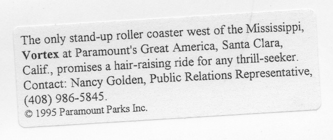
Just saw your scans of the old Marriott's Great America brochures from Santa Clara. Man, do those bring back memories. I used to have all of those, too! I was obsessed with that park growing up - it was the closest to us and it was an hour away, but I always wanted to go. LOVE the art direction on the cover of the brochure where it looks like construction paper. Super unique for that time - almost looks like something you'd see now. All the stuff about Vortex also reminded me of the glossy 8x10 the park sent me back in the day after Paramount purchased the park. Glossy 8x10 of Vortex from GA, circa 1995? Glossy 8x10 of Vortex from GA, circa 1995?
-
New TPR Header Logo...
PortugePunk replied to robbalvey's topic in Theme Parks, Roller Coasters, & Donkeys!
Couldn't agree more about the font. I really HATE Gadzoox. No the style or anything. It's just drawn poorly and really bad type... but... the context as it's used, I think it looks pretty good! -
New TPR Header Logo...
PortugePunk replied to robbalvey's topic in Theme Parks, Roller Coasters, & Donkeys!
Keep! -
New TPR Header Logo...
PortugePunk replied to robbalvey's topic in Theme Parks, Roller Coasters, & Donkeys!
I wouldn't mind seeing the yellow outline 1/2 pt thinner, either. I think it's fine the way it is now, but would be cool to see it as just a hairline. -
New TPR Header Logo...
PortugePunk replied to robbalvey's topic in Theme Parks, Roller Coasters, & Donkeys!
I think the slightly darker green is really helping! The yellow just doesn't resolve well around that primary green. Nice, Robb! -
That's freakin' beautiful! Kind of a treat.
-
Photo TR: Celebration City (Defunct)
PortugePunk replied to chadster's topic in Photo Trip Report Archive
such a shame about this place. ozcat looks awesome! reminds me a bit of boardwalk bullet. sad. cool pics, though. thanks for sharing! -
OH man these photos are coaster PORN for the day. This thing is looking AMAZING. A visit to Dallas may be necessary next year!!!
-
I'm usually not down with Vekoma at all, but I gotta say... their new trains look BAD ASS!