ILoveRides
-
Posts
828 -
Joined
-
Last visited
Everything posted by ILoveRides
-

Hopi Hari Theme Park 2011 - Brazil
ILoveRides replied to Lucas.Almeida's topic in Theme Parks, Roller Coasters, & Donkeys!
I've never ridden this one, but it appears from pictures that it didn't have seatbelts. The park index doesn't have a great picture of the restraints, but you can search "La Tour Eiffel Hopi Hari" on Google Images and it brings up several pics. -
I'm a little surprised Disney doesn't have a better plan in place to handle situations like this. As multiple people in the video said, "isn't there security?" It seems like it took extra help a long time to get there, and because no one showed up guests had to get involved to help.
-
Walt Disney World Epcot Discussion Thread
ILoveRides replied to SharkTums's topic in Theme Parks, Roller Coasters, & Donkeys!
Thinking about the problem a little more: Assuming parades, fireworks, and other shows that draw large amounts of people to a small area are the majority of the problem, I wonder if they could study guest usage patterns during these events and use the data to try to account for the increased Fastpass usage during these times. For example, if after a parade they find that approximately 100 extra people swarm the nearby Fastpass line, they could give out 100 less Fastpasses for the window right after the parade, thus helping to ease the problem a bit. This probably wouldn't be a perfect solution, but anticipating traffic patterns could certainly help ease the problem. (Note: I don't know if they already do this or not.) -
Walt Disney World Epcot Discussion Thread
ILoveRides replied to SharkTums's topic in Theme Parks, Roller Coasters, & Donkeys!
I've been in standby lines when this has happened, and I agree it sucks, but I still think it's worth it. I really enjoy not having to stress out about being certain places at certain times. I'm at the park to relax, so I don't want stress and a strict schedule. I don't want to have to worry about staying in certain areas of the park so that I'll be close-by when my Fastpass time comes up. I don't want to have to think, "Will I be free at this time? Or will I be at a parade, in another line, or eating?" before I get a Fastpass. I get that sometimes the current policy will work against guests, such as the examples you gave, but the benefit seems worth it to me. It has worked this way for years and most people seem generally happy with it. I feel like they're trying to fix something that isn't broken, and in doing so they may cause more inconvenience and problems for guests. -
Walt Disney World Epcot Discussion Thread
ILoveRides replied to SharkTums's topic in Theme Parks, Roller Coasters, & Donkeys!
While I understand the arguments for changing this, does it really NEED to be changed? It seems to me that most people are happy they can come back after the printed time - whether it be for reasons out of their control (ride breakdown, long line somewhere else, etc), or just because it's more convenient for them to come later ("We were on the opposite side of the park," "We wanted to ride at night," "I was hungry so I wanted to eat first before riding," etc.) I just feel like despite the problems that having an open-ended return time causes, most people would still prefer it. It's much less stressful knowing that you can still ride even if you miss your scheduled time. Now rather than just enjoying your time at the park going where you please, you're going to have to make a point to be in certain areas at certain times, and you'll have to constantly keep mental note of what Fastpasses you have and where you need to be when. -
The Ray's Do Southern California!
ILoveRides replied to jray21's topic in Theme Parks, Roller Coasters, & Donkeys!
Nice TR Joey. I loved the high quality T-Rex photoshop. -
One suggestion for the company might be to add a fleet of GT-Rs as a lower priced option. They'd give a lot of the same experience, but would be a cheaper option. I'm not saying anything is overpriced - I don't think it is - I'm just saying that having a budget option might attract an even bigger audience, and the GT-R is an absolutely amazing car for the money.
-
TPR Front Page RE-Design Contest!
ILoveRides replied to robbalvey's topic in Theme Parks, Roller Coasters, & Donkeys!
Here's my design updated with boxes rather than plain text under the banner image... Version 9
-
TPR Front Page RE-Design Contest!
ILoveRides replied to robbalvey's topic in Theme Parks, Roller Coasters, & Donkeys!
^ I was thinking it would be easier to add or subtract items the way I did it, but I suppose it could be programmed to have more or less boxes as well if it was done Jack's way. I will look into doing it the other way. Here's my latest version with several other changes... Version 8
-
TPR Front Page RE-Design Contest!
ILoveRides replied to robbalvey's topic in Theme Parks, Roller Coasters, & Donkeys!
Latest version... Changes: - Shrunk the menu bar horizontally - Moved search up to fill the extra space beside the menu bar - Returned social networking icons back to the top of the page - Put back the login/register links at the top - When active, banner image text descriptors are now red rather than white - Email subscription form is one again centered horizontally Version 7
-
TPR Front Page RE-Design Contest!
ILoveRides replied to robbalvey's topic in Theme Parks, Roller Coasters, & Donkeys!
Oh and thanks for all your feedback throughout the whole process everyone! I don't really have time to respond to each post, but your opinions are all very useful, and I'm reading and considering them all. -
TPR Front Page RE-Design Contest!
ILoveRides replied to robbalvey's topic in Theme Parks, Roller Coasters, & Donkeys!
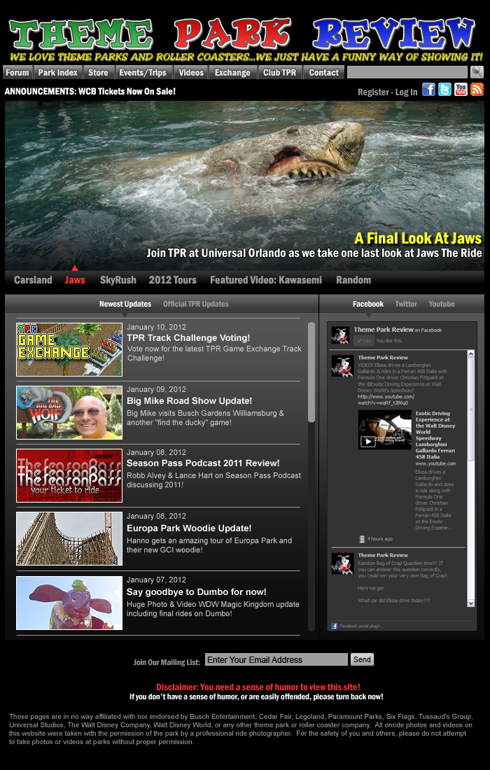
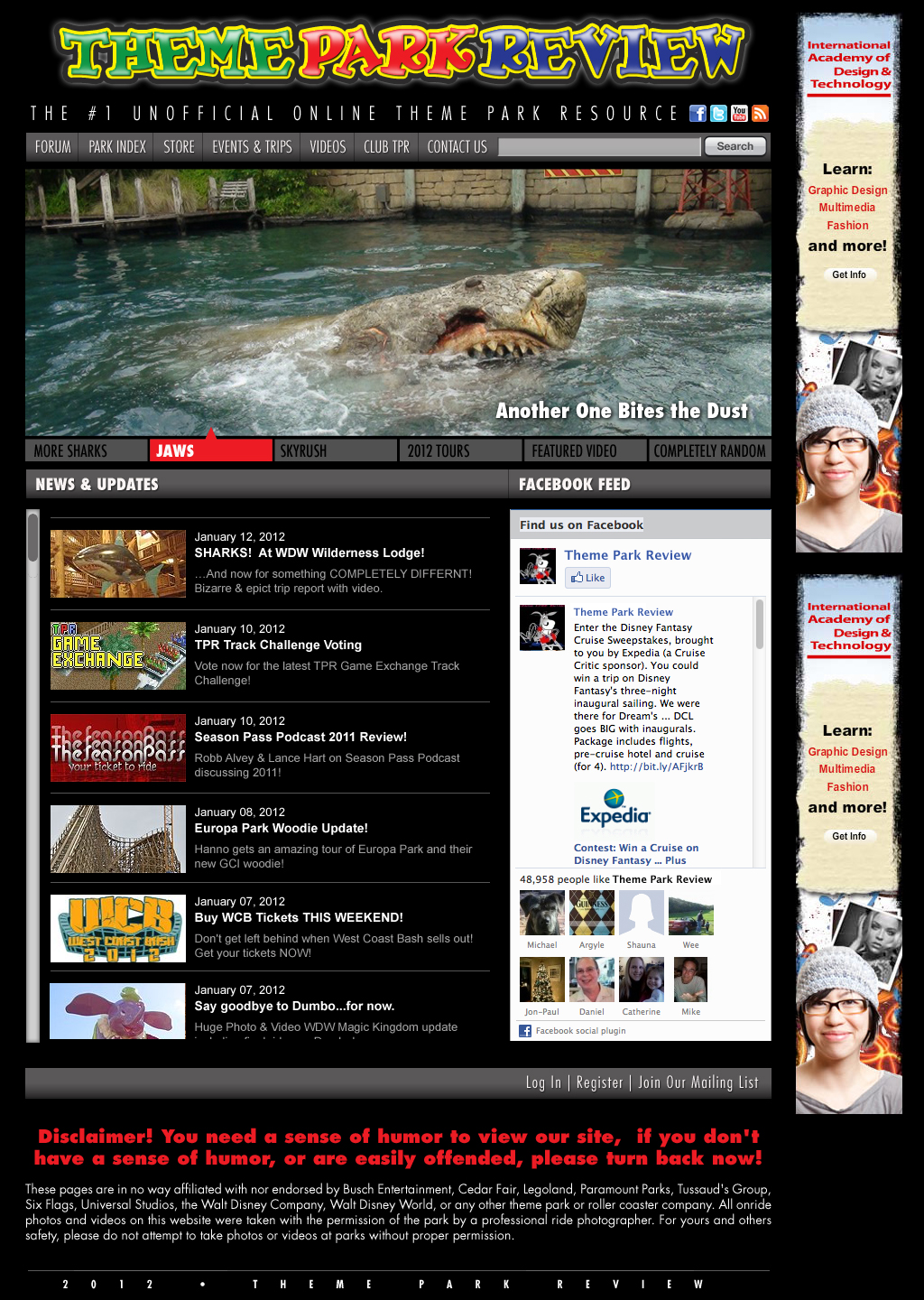
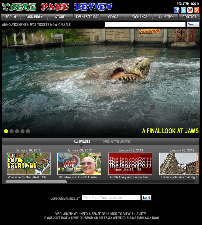
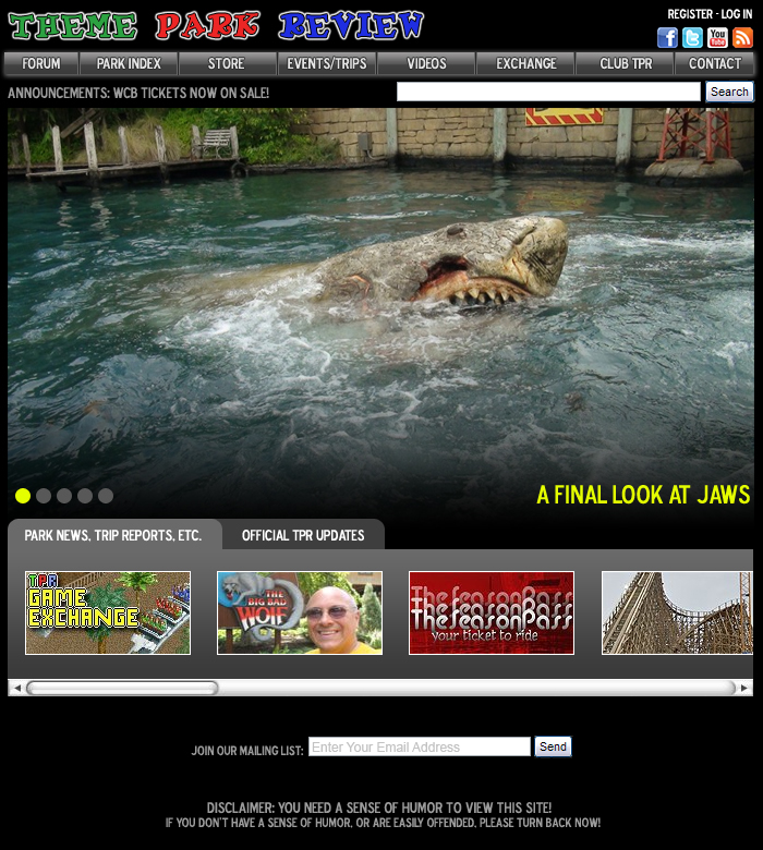
I made a few more modifications... Things changed from version 5: - Form boxes and button colors - Background color for the updates/social media content is darker, fades almost to black - Robb requested I use the original logo, which messed up my design a bit, so I had to make changes: I did away with the register/login buttons, the facebook/twitter/youtube/rss buttons were moved to the bottom of the page on the left, and the mailing list subscription form was moved right. I'm not sure how I feel about these changes. IMPORTANT: If you're leaving feedback, please try to be as specific as possible. Saying, "I like the top half" doesn't help much because I don't know where the cutoff point is. It would be more helpful if you say something like "everything above and including the banner image text descriptions (ie Carsland, Jaws, Skyrush, etc) is good." Also, I know it's hard to clarify these things sometimes, but if you can say WHY you like or dislike things, specifically what those design elements add or detract from the look or useability, that's much more helpful - because it lets us know the reasons behind why things work or don't work for you so that they can be better improved. My Design. Jack's Design.
-
TPR Front Page RE-Design Contest!
ILoveRides replied to robbalvey's topic in Theme Parks, Roller Coasters, & Donkeys!
Some issues that I feel should be addressed still in Jack's design: - The scroll bar for news and updates needs to be on the right hand side. - In my opinion, the login/register buttons need to be at the top of the page, not the bottom. - The menu bar looks squished to me. There is also no room for expansion if an item ever needs to be added. - I think it's missing an announcements section. I suppose announcements could be part of the banner image, but then people are likely to miss them. - The disclaimer stands out more than almost anything on the page. - The Facebook feed should be dark - The 2012 - Theme Park Review at the bottom seems kind of weird and unnecessary. - Join our mailing list should really be an input box, not a link, to encourage people to join on impulse. Some issues that I feel should be addressed in my design (Please help me find more!!!): - Modify the logo a bit (adding a tag line, centering, etc)... just play around with it. I'm not sure if any of these modifications will "stick," but enough people have commented about the logo that it warrants a re-think. - Make the search and email input boxes darker so that they don't stand out so much. - Make the search and send buttons more modern looking (rounded corners, magnifying glass image?, stuff like that) - Someone said they don't like gray as the background color. I agree! But I was trying to have it match the rest of the site, and not stray too much from the current design. That said, I will play around with darkening the background color. -
TPR Front Page RE-Design Contest!
ILoveRides replied to robbalvey's topic in Theme Parks, Roller Coasters, & Donkeys!
^ I win!
-
TPR Front Page RE-Design Contest!
ILoveRides replied to robbalvey's topic in Theme Parks, Roller Coasters, & Donkeys!
Latest version...
-
TPR Front Page RE-Design Contest!
ILoveRides replied to robbalvey's topic in Theme Parks, Roller Coasters, & Donkeys!
I made some significant changes and am curious what people think. What I did: - Removed shadow from main menu bar - Banner image is smaller in height - Search box reduced in width - "All Updates" tab label is now "Newest Updates" - Updates now scroll vertically - Updates have a title and full description - Added a social media column for Facebook and Twitter feeds Thoughts? (Also, credit where credit is due - I'm trying to make a hybrid of the best elements between my design and Jack's design. So some of the ideas are from his design.)
-
Me too! I would love to see them bring back the shack, the soapbox racers, and the parachutes someday. All 3 were great attractions that I consistently hear people talking about. I think with a little re-imagining they could all be popular with a modern audience. There was a crowd for the event in the morning, but that quickly dispersed afterward. All the rides I rode were walk-ons. It was a great day to be at the park! Beautiful weather too.
-
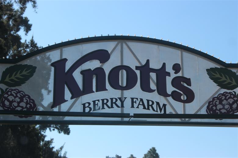
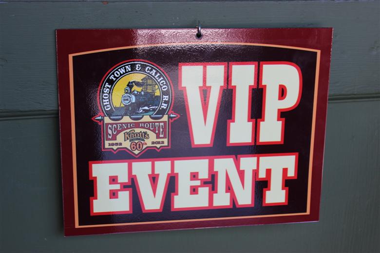
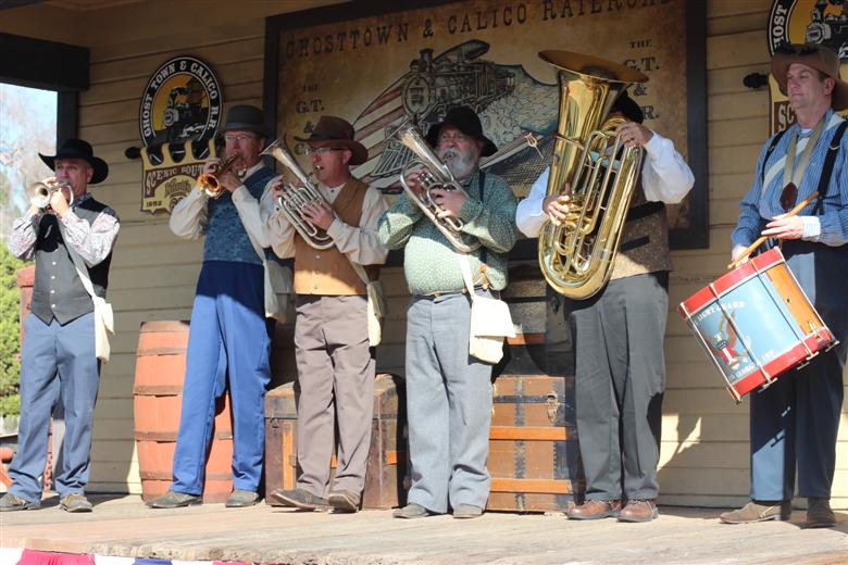
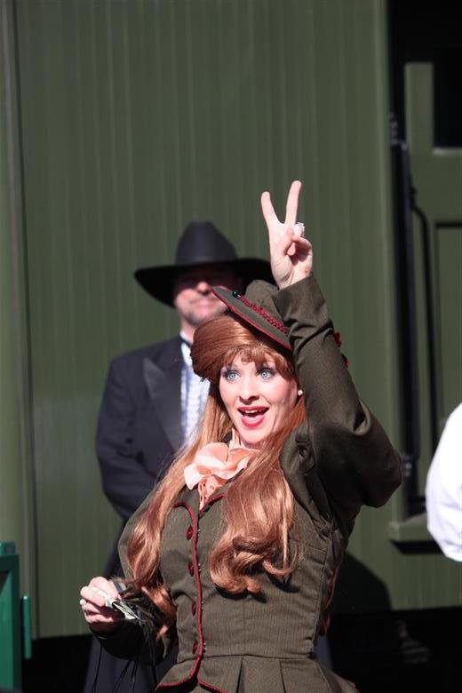
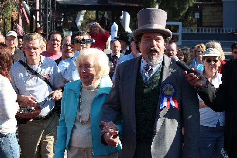
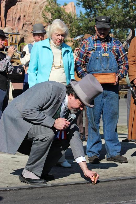
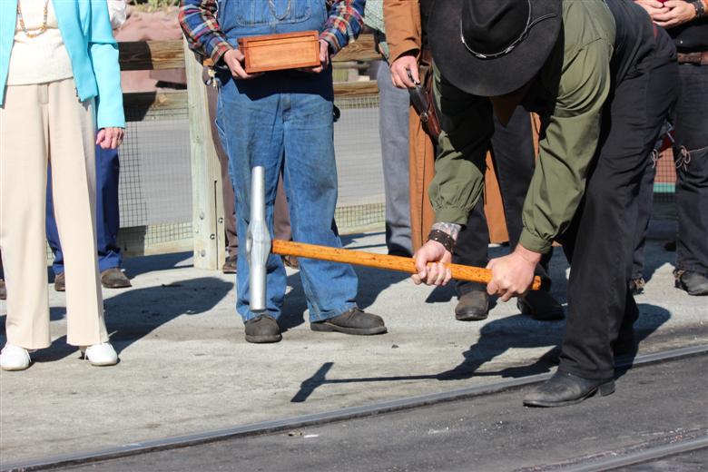
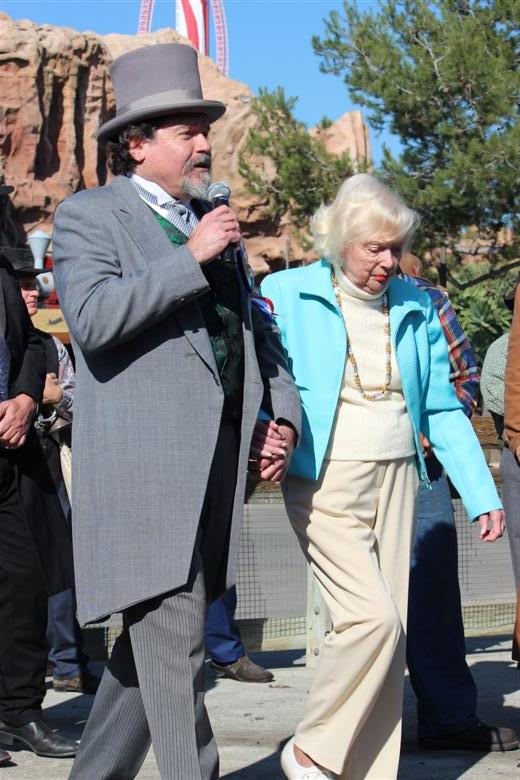
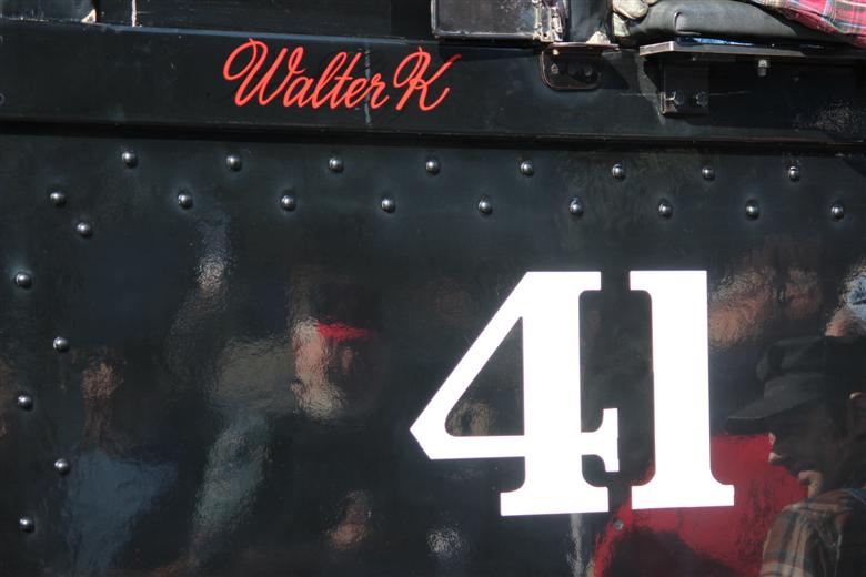
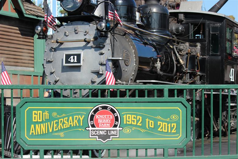
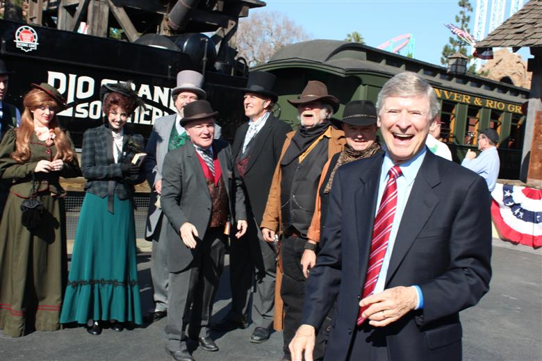
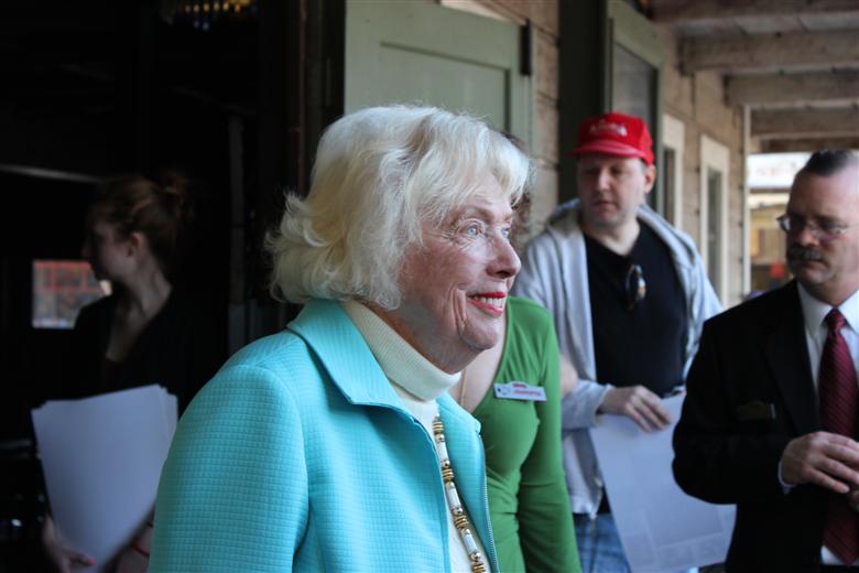
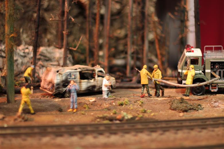
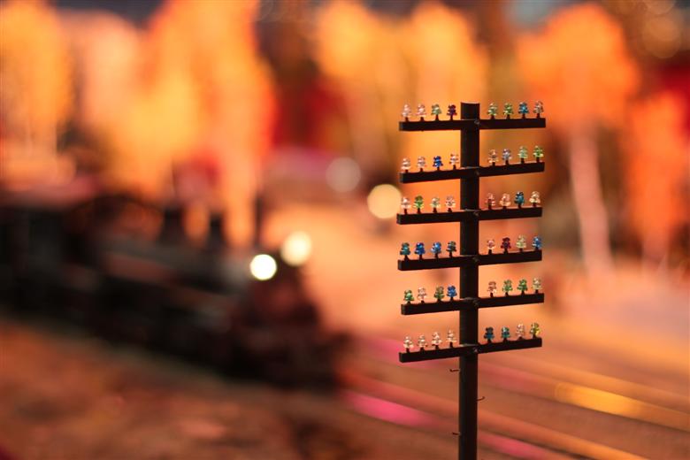
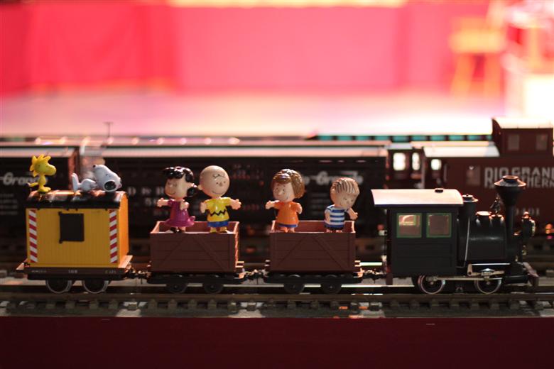
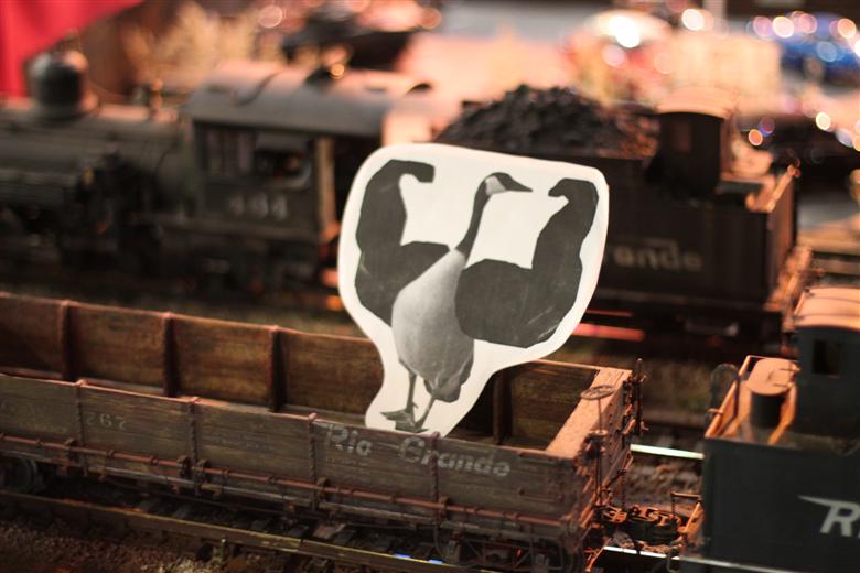
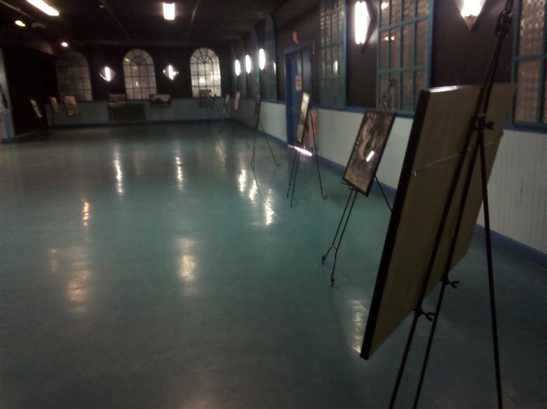
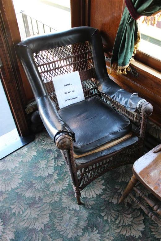
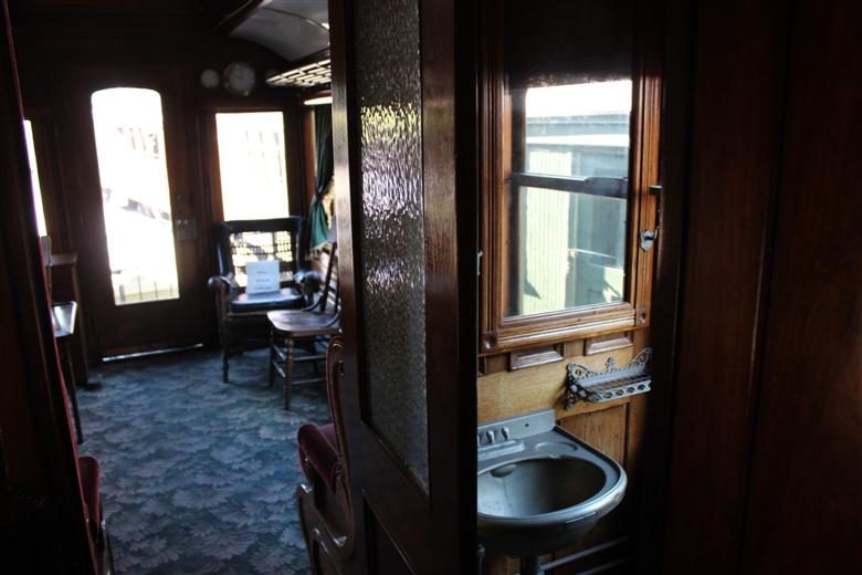
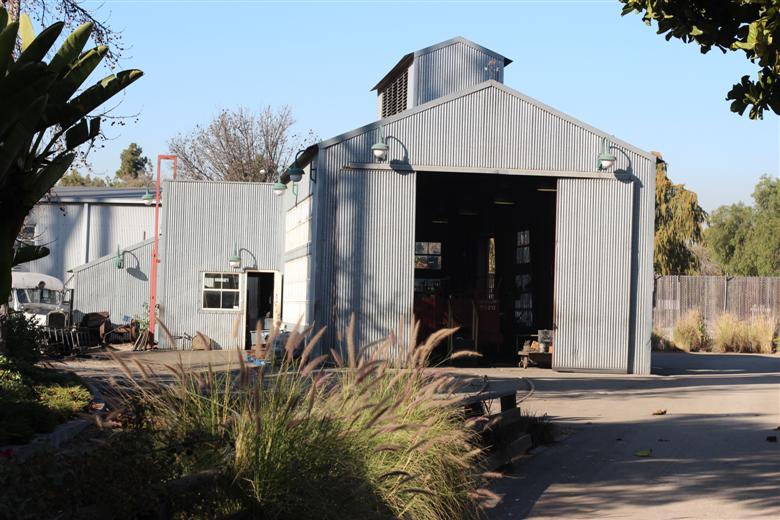
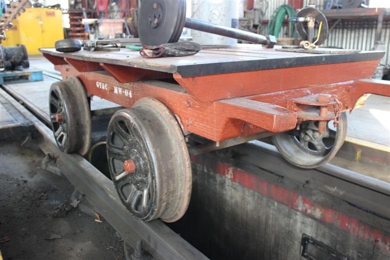
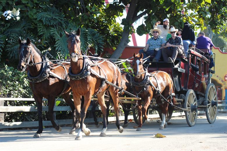
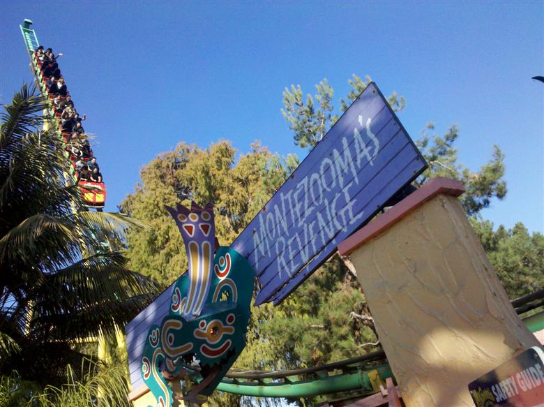
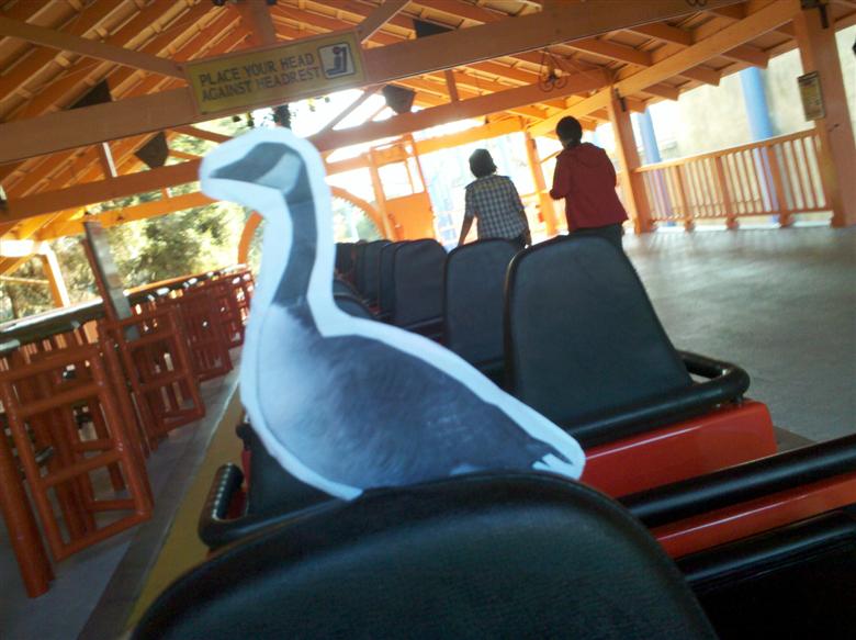
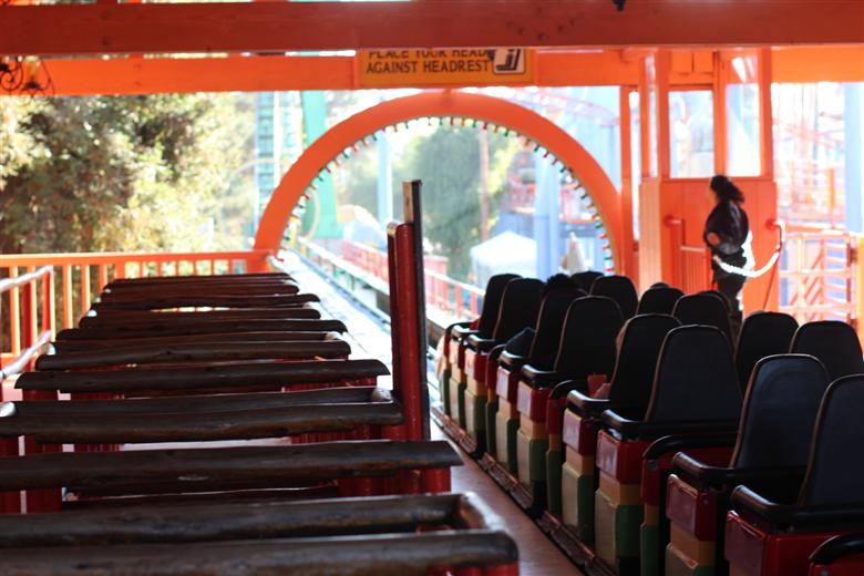
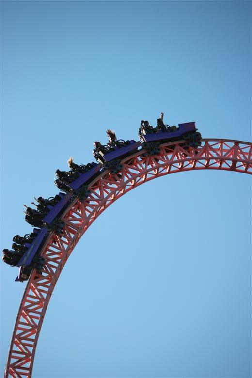
Today was the 60th anniversary of the Knott's railroad, and TPR was there! TPR is at Knott's Berry Farm... ... for the Ghost Town and Calico Railroad 60th Anniversary Event. And there is food! Now I have your attention! It's not everyday you see Marion Knott, Walter Knott's daughter, standing outside the Calico Saloon! The band took to the stage. There were lots of costumed entertainers. The mayor came out and walked Marion over to the train tracks. He readied the golden spike. Then with a huff... ... and a puff... The spike was driven in! Gertrude used her giant muscles to help hammer the spike in all the way. The mayor then walked Marion over to Engine 41. Which was christened the "Walter K" in honor of Walter Knott. Walter would be proud! Everyone waved off the newly christened train. Bye bye train! Happy 60th anniversary Knott's railroad! You are truly something special! Marion enjoyed her ride on the train. All the reporters and news stations began interviewing people. Orange County newscaster and former Knott’s stagecoach cowboy Ed Arnold had fun with the entertainers. He seemed like an awesome guy! I couldn't resist getting a picture with everyone. Marion did a few more interviews, then disappeared off into the ghost town. Which I took as my cue to ride the train! AHHHH!!!! TRAIN ROBBERS!!! Just my luck. After being mugged for everything I had, I headed over to the Boardwalk Ballroom to check out the Del Oro Pacific. The Del Oro Pacific is one of the largest modular g-scale train layouts in the U.S. If you didn't already know, I'm kind of obsessed with trains (both real and model ones). I collect g scale trains, so this layout was right up my alley! Since I love trains so much, I'm going to bombard you with lots of model train photos! Good thing the fire department showed up... that could have gotten out of hand. TRAIN!!! Maybe the reason I like roller coasters is because they're basically trains that go up and down. This layout is very impressive. That's an interesting assortment of vehicles. Hey, look! It's Snoops! (and friends) Gertrude followed in Snoopy's footsteps and decided to hop in a train car for a few laps. The Del Oro Pacific was a really neat addition that added a lot to the anniversary event... great planning Knott's! And if you weren't there, you still have a few days to get to Knott's and check the layout out. There were also a bunch of historic photos set up in the ballroom. Some of them were very cool! I spent a lot of time looking over every detail. Next up, I had a tour to catch! First up on the tour was the Edna train car. This chair is 131 years old... almost as old as Jeff Johnson, but not quite! The Edna was built in 1881 for the personal use of the President of the Rio Grande Southern Railway. This is basically what it would look like if you were sleeping in the Edna. Next up on the tour was the engine roundhouse. Many of you probably remember this tour from West Coast Bash 2010. The tour was actually given by the same guy, Tom. Which is great, because he's really knowledgeable and clearly loves his job. Unlike at West Coast Bash, there were some different cars and an engine in the roundhouse this time. But basically it's the same roundhouse we all got to know and love. Tom taught us all about the smoke box on the steam engine. A shot of the engine in the roundhouse. As we were leaving we had to wait for a stagecoach to pass. Only at Knott's! Good news! Montezooma's Revenge is back up and running. YAY! Gertrude wanted to ride. Gertrude loved it! The ride op even timed it so that the Jaguar train threaded the loop while we were going around it. Then it was over to Xcelerator. You just can't go wrong with Xcelerator. I used to think Kinda Ka and Top Thrill Dragster looked so much better than Xcelerator. But after riding the others this summer, I can confirm that they don't even compare... Xcelerator is much, much more fun. Don't worry Silver Bullet, I didn't forget about you! Fun as always. Thanks Knott's for hosting this wonderful event. Here's to another 60 years of the Ghost Town and Calico Railroad! BONUS PIC! Manly Pose enthusiasts - shield your eyes, I have bad news. I was driving home from Knott's when I saw that Man's Town, the store that inspired the first manly pose, went out of business. It's a sad, sad day for the Manly Pose.
-
TPR Front Page RE-Design Contest!
ILoveRides replied to robbalvey's topic in Theme Parks, Roller Coasters, & Donkeys!
^ Here it is with no shadow on the menu bar.
-
TPR Front Page RE-Design Contest!
ILoveRides replied to robbalvey's topic in Theme Parks, Roller Coasters, & Donkeys!
^ Here's what it looks like with no outline on the menu. I'm torn - I like it both ways.
-
TPR Front Page RE-Design Contest!
ILoveRides replied to robbalvey's topic in Theme Parks, Roller Coasters, & Donkeys!
Updated the tabs, updated the scroll bar, and added text to the updates...
-
TPR Front Page RE-Design Contest!
ILoveRides replied to robbalvey's topic in Theme Parks, Roller Coasters, & Donkeys!
I've seen both "forums" and "forum" on various sites, I'm not sure if there's a "correct" way. It could easily be modified though. I just copied what is currently on the main site. -
TPR Front Page RE-Design Contest!
ILoveRides replied to robbalvey's topic in Theme Parks, Roller Coasters, & Donkeys!
Here's what I'm working on... - For the update images, the text describing each one could either appear when the user mouses over the image, or it can be above and below like angry_gumball did. - The announcements text will "tick" or scroll by vertically every few seconds, so there can be multiple announcements. Thoughts?
-
TPR Front Page RE-Design Contest!
ILoveRides replied to robbalvey's topic in Theme Parks, Roller Coasters, & Donkeys!
I completely agree with this. I would almost say do away with the random category, or if not, give it one of the least prominent places on the page. The main things that get your attention should either be announcements or high quality new content, not random stuff from years ago. -
Now you're really banned!