DragonKhan Posted September 26, 2005 Posted September 26, 2005 (edited) Hey everybody! Quite some time ago I build a park I really liked, and I didn't put it up here yet, so I figured why not... It requires Wacky Worlds, which is also the reason I can't load it anymore since I don't have WW on my laptop. so yeah, can't even see it for myself... But trust me, it's worth a download. I'd be really grateful if someone could snap a few nice pics and send them to me so I could upload them aswell... Silver City.SV6 the savefile Edited November 10, 2010 by mcjaco
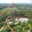
DragonKhan Posted September 27, 2005 Author Posted September 27, 2005 (edited) Okay, I found someone to take pics for me quick. since everybody seems to really need them before something gets downloaded... Entrance, the main street and a nice surprise in the background The station of "Silver Bullet" The main attraction... "Silver Legend" Here's an overview of most of the park... Edited September 28, 2005 by DragonKhan
AllisonY2K Posted September 28, 2005 Posted September 28, 2005 ^^ Okay Grumpy, Snow White called she said you can come hang out with her and the other 6 dwarves. Anyway, who wants to see Silver City!? Well I'll give you a brief tour and then I'll let DragonKhan talk more about it. First we have an overall park view. Small park (like mine) and it's loaded with all kinds of theming and scenery and stuff. So..here's an overall view of Silver City. Here is one corner of the park with the awesome wooden coaster, which I believe is called Silver Bullet. I had to turn off the scenery to see where the track went because it's hidden that much. Great job! Next up is another corner of the park which has the vertical drop coaster Shaft of Terror. Hmmmm...I think I've called a guy that once or twice after a scary ride. Um...I don't think I should have shared that. Next up is a corner down by the park entrance with 2 MORE coasters. Still noticing the awesome theming and buildings? I am. Finally here is the final corner of the park. No coasters in this section but there is a train ride, go-karts and a log ride. and before I forget, here is a view of the park without scenery. I counted a total of 5 coasters in this park! You have to see this to see just how much stuff he put into this park and then covered it all up with theming and buildings. A very, very good solid park. Alright DragonKhan, you can finish this tour and talk more about the park if you'd like.
DragonKhan Posted September 28, 2005 Author Posted September 28, 2005 LOL! Oh well, thanks anyway, I guess that's plenty now Just two things: The woodie is "Silver Legend"... And where did I put in go Karts?! lol
Stitch Posted September 28, 2005 Posted September 28, 2005 Very nice park, I can tell you put a lot of effort in to it. Do you have any other parks you would like to share?
DragonKhan Posted September 28, 2005 Author Posted September 28, 2005 I've ahve quite a bit back home in Switzerland, but not here. not too many parks though because of two reason. Too time consuming with all the detail I build, and again because of the detail, I hit the limit too early. that's why I also only have little parks. I have quite a bunch of fine tracks though...
blitz Posted September 28, 2005 Posted September 28, 2005 heh. Someone from the NE/rct2.com side of things...
DragonKhan Posted September 29, 2005 Author Posted September 29, 2005 Never posted on NL or rct2.com I just enjoy making extemeley realistic and detailed parks Hey, it would be great to get some more critisicm on this park because I'm planning on building a second "mini park"... So... Praise is welcome, but please include critisicm and suggestions as well
Ed Posted September 29, 2005 Posted September 29, 2005 Looks very nice. It looks alot better than some of the over themed parks you find at NE which are all about showing off, where as this shows realistic designs and themes. I just found this on my pc btw, I swear you built this when you used to post on cf.
DragonKhan Posted September 29, 2005 Author Posted September 29, 2005 LOL! Yes that is actually mine. A lot of peaople seemed to like it, even though it's one of my favorites... I posted quite a few on CF... Looks very nice. It looks alot better than some of the over themed parks you find at NE which are all about showing off, where as this shows realistic designs and themes. I really love the parks on NE, and I also got a lot of inspiration there. But there was always something that bothered me. For me, a park has to be fully operational with all its attractions. Guest should be happy and not get lost, the park should be clean etc. Basically the way RCT was ment to be played. I just add a lot of themeing and realism to it (straight lifts, working blocking system, high capacity, pre-drops, good length, smooth transitions etc.)
blitz Posted September 30, 2005 Posted September 30, 2005 Hey, I used to be like that too. After playing the game for so many years (since the very first rct release, before any expansion packs), that sort of mentality would have killed my drive/love for the game. Only by keeping it fresh have I lasted so long. The issue with "playing the game the way it was supposed to be" is that you are only picking the points of the game you yourself feel represent the game best. The truth is, nothing short of a full blown personal scenario with actual goals can bee seen as "using the game the way it was intended". Onto the next thing... If you want criticism... well, I don't know if you really want mine. I'm very very hard on rct players, even on some of the 'better' NE players. Even if they are parkmakers. So if you have the stomach, here goes: Your choice of colors is uninteresting. Your choice of texture is without explanation (doesn't work with the theme). Your path layouts uninspiring. Tree selection and placement looks lazy. Elevation is there, but it's not being put to any use. And your structures themselves are sloppy (oh yeah, and unless you have a VERY good reason, stay away from shrubs on buildings). Other than that, seems good . In a nutshell: You lack proper execution. In NE speak, it'd be said that "There is nothing there to criticize, because there is nothing there to begin with". The answer is to spend more time on the little things, and get to know the visual levels the game can go into. I can't really say much on the coasters until I see them in action, but from what I can tell structurally (from the woodie), you fall into a few pitfalls that generally plague NE players, like the faux "overbanked" turns. You abuse those, and rising and falling turns way too much. Also, be a bit more intuitive with the layouts of your coasters, or they'll turn out cliched. I do actually like your park, because you don't rely on a bunch of set "techniques" that random NE people CLING to DESPERATELY. But from a purely objective point of view, it doesn't do much (cliche or not) anyway. Take all this with a grain of salt. I AM one of those "over theming" guys from NE. One of the worst ones, infact I also hope you find this just a little bit useful ^_^. It's hard to critique art from an aesthetic standpoint. One man's trash is another man's treasure, as they say... Just know, that since it is here, I'm going to be more lenient. If you posted this at NE, I would have been much more exacting.
DragonKhan Posted September 30, 2005 Author Posted September 30, 2005 Thanks for the critiscm, since that's the only way to improve... Lazy with trees? Yeah, I guess. They fill up the room that I didn't theme much. But much better then repeating the same tree all the time The path layout is very simple, yes, but in a park that size you don't have many choices. Same goes with use of evelation, even though I don't really understand. Especially on the mine mouse and the woodie I think i made great use of it... There aren't too many of those "overbanked turns" on the Woodie. They stand out though because they're visible. Much of the layout is not seen in the screenshots. You have to see it for yourself... Choice of color? Well, true that, I usually use a little bit more, but I don't see how textures don't fit. Seem fine to me... The shrubs on the roofs? Well, I know, seems kinda stupid and I aggree, but they always seem to be so empty without a little decoration. but you're right there... I think I've put in many details, but you kinda have to look for them since they're not too easy to spot...
chauncey Posted September 30, 2005 Posted September 30, 2005 The issue with "playing the game the way it was supposed to be" is that you are only picking the points of the game you yourself feel represent the game best. The truth is, nothing short of a full blown personal scenario with actual goals can bee seen as "using the game the way it was intended". That's what I do, Blitz! I build a scenario from scratch, and then play it! Maybe someday one of my "for fun" ones will be worth showing, or one of my "contest" ones will be finnished! Or not. Probably not. Definitely not. Not that I need to tell you that... Anyways. I agree with Blitz, except the colors. I think brown is a very beautiful color.
blitz Posted September 30, 2005 Posted September 30, 2005 Thanks for the critiscm, since that's the only way to improve... Lazy with trees? Yeah, I guess. They fill up the room that I didn't theme much. But much better then repeating the same tree all the time The path layout is very simple, yes, but in a park that size you don't have many choices. Same goes with use of evelation, even though I don't really understand. Especially on the mine mouse and the woodie I think i made great use of it... There aren't too many of those "overbanked turns" on the Woodie. They stand out though because they're visible. Much of the layout is not seen in the screenshots. You have to see it for yourself... Choice of color? Well, true that, I usually use a little bit more, but I don't see how textures don't fit. Seem fine to me... The shrubs on the roofs? Well, I know, seems kinda stupid and I aggree, but they always seem to be so empty without a little decoration. but you're right there... I think I've put in many details, but you kinda have to look for them since they're not too easy to spot... ah, the issue with the shrubs... is that you have to find other ways to make your buildings NOT empty. There are things you can do, changes in shape, making the structure more complicated, more complete. Shrubs are a really ghetto shortcut to making buildings stand out, which is just one of the reasons to avoid them. Also avoid them because they really are unrealistic when you think about it. If there are flowers and bushes on a ROOF, then there is something about that roof that must stand out... is there a path up there? are people up there? is it a top-side greenhouse?... or are you just being lazy and putting shrubs there for the heck of it? You have to ask yourself these questions when you build. And don't listen to chauncey about colors =P you used the same wall types everywhere. And they are infact ugly. On top of that, they aren't realistic either. They are actually MINE WALLS, not walls meant for buildings, atleast buildings of that size. And then you have the light light tan colored buildings... and the texture on those does not fit the theme of a mining town (I'm assuming that's the theme? Not sure, given what I have to judge from). Likewise, the jungle rooves are totally out of place, and are not easy on the eyes at all. Elevation... this is something NE parkmakers have huge issues with even, so if you don't understand, I don't blame you. Elevation is the use of higher and lower ground to give dimension to the surroundings and structures. It is also used to aid in the focus, and adds much to the atmosphere through it's variation. If you want a really good example of clever elevation, look through any mala park. Especially mount sinister, cydonia, and mountain beach! (if you don't have rct1, then go for the escalante and the rift valley) http://www.nedesigns.com/?ne=parkmakers&a=view&p=14 Also note that the use of elevation for coasters is to keep focus on them. Even if you have some coaster built into a mountain, it doesn't mean that meeting of elements is dynamic. Anyway... as for the trees, they aren't positioned dynamically, and there isn't enough variation. Remember that trees don't usually come ALONE, there's also bushes on the ground, meadows, thickets, etc. The shoreline will have a different look than the inland, the higher ground will have a different look than the lower ground, the closeness to civilzation will also effect these things. Remember flowers too. Wild flowers exist in meadows and sunny side brush (think open mountain trails). Take note of geography and how it will effect your tree selection is the basic idea here. Don't mix pre-fabricated buildings with custom ones. The clash of style will kill your park. teal + brown = bad. Red + tan when a dark brown is present = bad. No random fountains/water geysers. VARIATION makes things interesting, but STRUCTURE makes them believable. Balancing Symmetry and Asymmetry is what makes first makes a building. THEN the details. If something is not makeshift (any structure) then do your best to make it look like it's been there since the dawn of time, and wont budge till the end of it. If something IS makeshift, go out of your way to illustrate that. A lot of structures in your park look "makeshift" but if it's a mining thing, you want to make things look antiquated, and solid. That covering over the carousel does not work there. That's all for now, I'll go into the park later.
DragonKhan Posted September 30, 2005 Author Posted September 30, 2005 Whoa, you REALLY judge hard!!! Is it really THAT bad?! No really, I DO appreciate it. I'll remeber those things next time, even though I like my style at certain things better than what I see on NE, so I won't change that...
ParkTrips Posted September 30, 2005 Posted September 30, 2005 I happen to think more than half of the parks in that link look like crap because they are too exaggerated (c'mon, how many skull heads in random order do we need on that island?) and unrealistic in parts, which is why this all boils down to pesonal preference. I think DragonKhan's work here is pretty darn good
chauncey Posted September 30, 2005 Posted September 30, 2005 c'mon, how many skull heads in random order do we need on that island? 1. If you look, the skulls are not in a random order. 2. We need as many skulls as we can get! Skulls > bushes, and Bush, but not bush. Anyways...
blitz Posted October 1, 2005 Posted October 1, 2005 lol @ the skull bashing and the exaggerated nature is what you are looking for to help draw the person in and suspend their disbelief. "Emersion" is the key word here. If you only create things that are sloppy approximations of what you want, they won't be believable. The other way to do things is to create "stylized" approximations that may not be realistically proportioned whether in use or scale. The point in this way is to make that thing LOOK good, so that it contributes to the atmosphere and mood of the park in unique way. Some of the things I said are plainly opinion... but basically, anywhere that could have been payed a little more attention or have been given a little more detail, was pretty much something you could work on if you were interested in getting better and putting out a product you can be much prouder of.

Recommended Posts
Create an account or sign in to comment
You need to be a member in order to leave a comment
Create an account
Sign up for a new account in our community. It's easy!
Register a new accountSign in
Already have an account? Sign in here.
Sign In Now